애플리케이션 측 SDK 통합
- 로그인 시스템, 인게임 스토어 및 기타 페이지에서 사용할 인터페이스를 디자인합니다.
- SDK 메서드를 사용하여 사용자 인증, 스토어 디스플레이, 구매 등을 위한 애플리케이션 로직을 구현합니다.
<xsollaExtention>/assets/scripts/samples 디렉터리에서 확인할 수 있습니다.사용자 이름/이메일 및 암호를 통한 사용자 등록 및 로그인
SDK 메서드를 사용하여 구현하기 위한 지침:
사용자 이름 또는 이메일 주소로 사용자를 인증할 수 있습니다. 다음 예시에서 사용자를 사용자 이름 이름으로 인증합니다. 반면 이메일 주소는 등록 확인 및 암호 재설정에 사용합니다.
사용자 등록 구현
이 튜토리얼이 설명하는 논리의 구현:

페이지 컨트롤러 생성
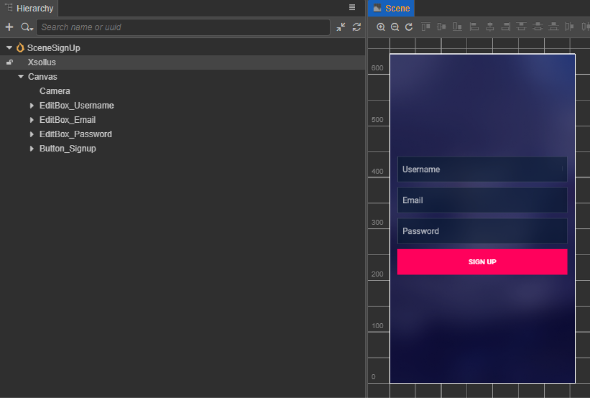
등록 페이지용 장면을 생성한 후 추가할 요소:
- 사용자 이름 필드
- 사용자 이메일 주소 필드
- 사용자 암호 필드
- 등록 버튼
페이지 구조 예시:
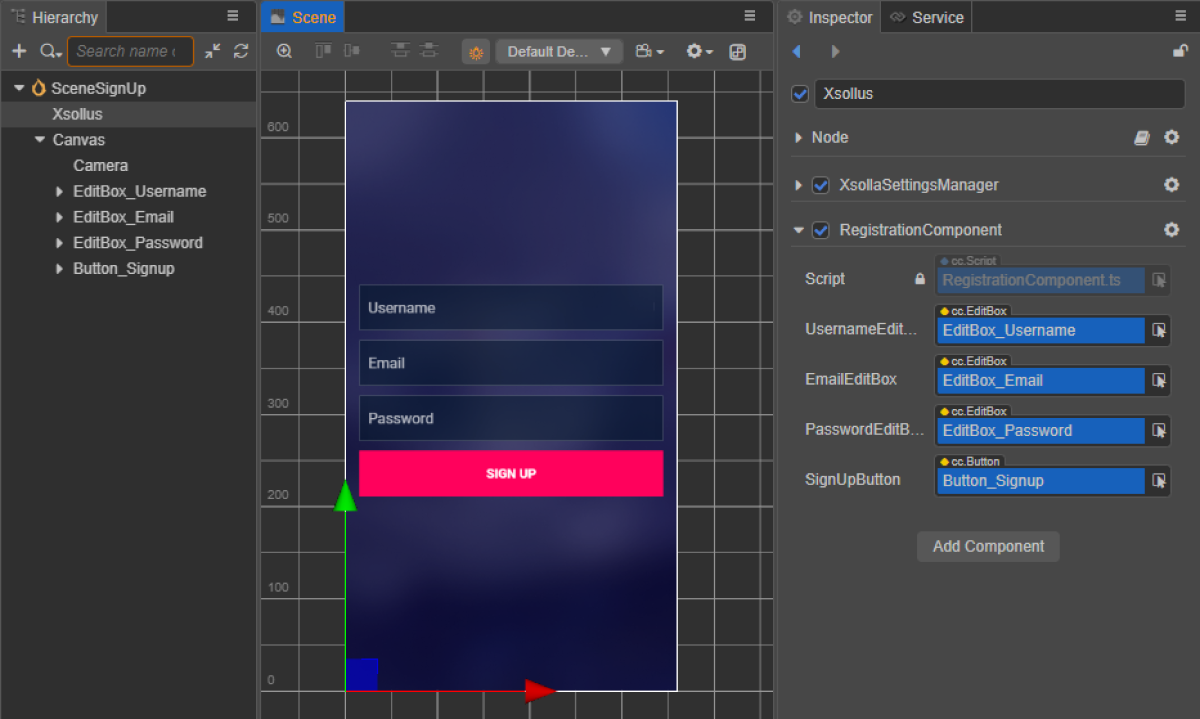
등록 스크립트 구성 요소 생성
- RegistrationComponent 생성을 클릭한 후 다음 속성을 추가합니다.
usernameEditBoxemailEditBoxpasswordEditBoxsignUpButton- 선택 사항입니다. 코드를 사용하여 콜백 함수를 버튼에 바인딩할 때 사용합니다.
- 스크립트 예시와 같이
SignUpButton을 클릭할 때 호출되는 메서드를RegistrationComponent클래스에 추가하고, 클릭 이벤트를 처리하는 로직을 추가합니다. - 장면의 노드에 RegistrationComponent를 추가합니다. 새 노드를 추가하거나 SDK 초기화를 수행하는 동안 추가한
XsollaSettingsManager구성 요소가 있는 기존 노드를 사용할 수 있습니다. - 그림과 같이 장면 요소를
RegistrationComponent의 속성에 바인딩합니다.
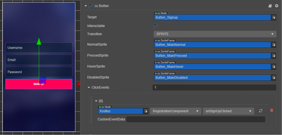
- 다음 방법 중 하나를 사용하여 등록 버튼에 콜백을 바인딩합니다.
- 아래 그림과 같이
Inspector 패널 사용 - 페이지 스크립트에 아래의 코드 블록 삽입
- 아래 그림과 같이
코드를 통한 바인딩 콜백:
- typescript
1start() {
2 this.signUpButton.node.on(Button.EventType.CLICK, this.onSignUpClicked, this);
3 }
스크립트 예시에서 onComplete 및 onError메서드는 표준 console.log 메서드를 호출합니다. 오류가 발생하면 오류 코드 및 설명이 error 매개 변수에서 전달됩니다.
등록이 성공적이라면 등록 이메일 또는 로그인 페이지 열기 요청 재전송을 포함하는 페이지 열기 같은 다른 동작을 추가할 수 있습니다.
- typescript
 1import { _decorator, Button, Component, EditBox } from 'cc';
 2import { XsollaAuth } from 'db://xsolla-commerce-sdk/scripts/api/XsollaAuth';
 3const { ccclass, property } = _decorator;
 4
 5
 6@ccclass('RegistrationComponent')
 7export class RegistrationComponent extends Component {
 8
 9    @property(EditBox)
10    usernameEditBox: EditBox;
11
12    @property(EditBox)
13    emailEditBox: EditBox;
14
15    @property(EditBox)
16    passwordEditBox: EditBox;
17
18    @property(Button)
19    signUpButton: Button;
20
21    start() {
22        this.signUpButton.node.on(Button.EventType.CLICK, this.onSignUpClicked, this);
23    }
24
25    onSignUpClicked() {
26        XsollaAuth.registerNewUser(this.usernameEditBox.string, this.passwordEditBox.string, this.emailEditBox.string, 'xsollatest', null, null, token => {
27            if(token != null) {
28                console.log(`Successful login. Token - ${token.access_token}`);
29            }
30            else {
31                console.log('Thank you! We have sent you a confirmation email');
32            }
33        }, err => {
34            console.log(err);
35        });
36    }
37}
등록 확인 이메일 설정
성공적인 등록 후 사용자는 지정된 주소로 등록 확인 이메일을 받습니다. 관리자 페이지에서 사용자에게 보낼 이메일을 맞춤 설정할 수 있습니다.
모바일 애플리케이션을 개발 중이라면 사용자가 등록 확인을 한 후에 애플리케이션으로 사용자들 돌려보내기 위한 딥 링크를 설정합니다.
등록 확인 이메일 재전송 요청 구현
이 튜토리얼이 설명하는 논리의 구현:

페이지 컨트롤러 생성
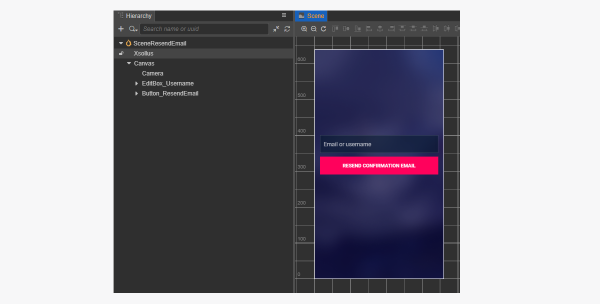
확인 이메일 재전송 요청 페이지용 장면을 생성한 후 추가해야 하는 요소:
- 사용자 이름/이메일 필드
- 이메일 재전송 버튼
페이지 구조 예시:
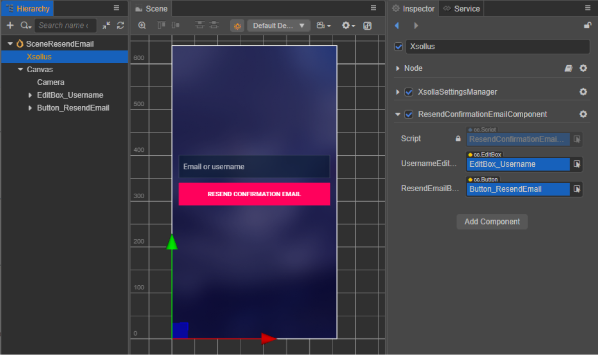
이메일 재전송 스크립트 구성 요소 생성
- ResendConfirmationEmailComponent 생성을 수행한 후 다음 속성을 추가합니다.
usernameTextBoxresendEmailButton- 선택 사항입니다. 코드를 사용하여 콜백 함수를 버튼에 바인딩할 때 사용합니다.
- 스크립트 예시와 같이
ResendEmail을 클릭할 때 호출되는 메서드를ResendConfirmationEmailComponent클래스에 추가하고, 클릭 이벤트를 처리하는 로직을 추가합니다. - 장면의 노드에 ResendConfirmationEmailComponent를 추가합니다. 새 노드를 추가하거나 SDK 초기화를 수행하는 동안 추가한
XsollaSettingsManager구성 요소가 있는 기존 노드를 사용할 수 있습니다. - 그림과 같이 장면 요소를
ResendConfirmationEmailComponent의 속성에 바인딩합니다.
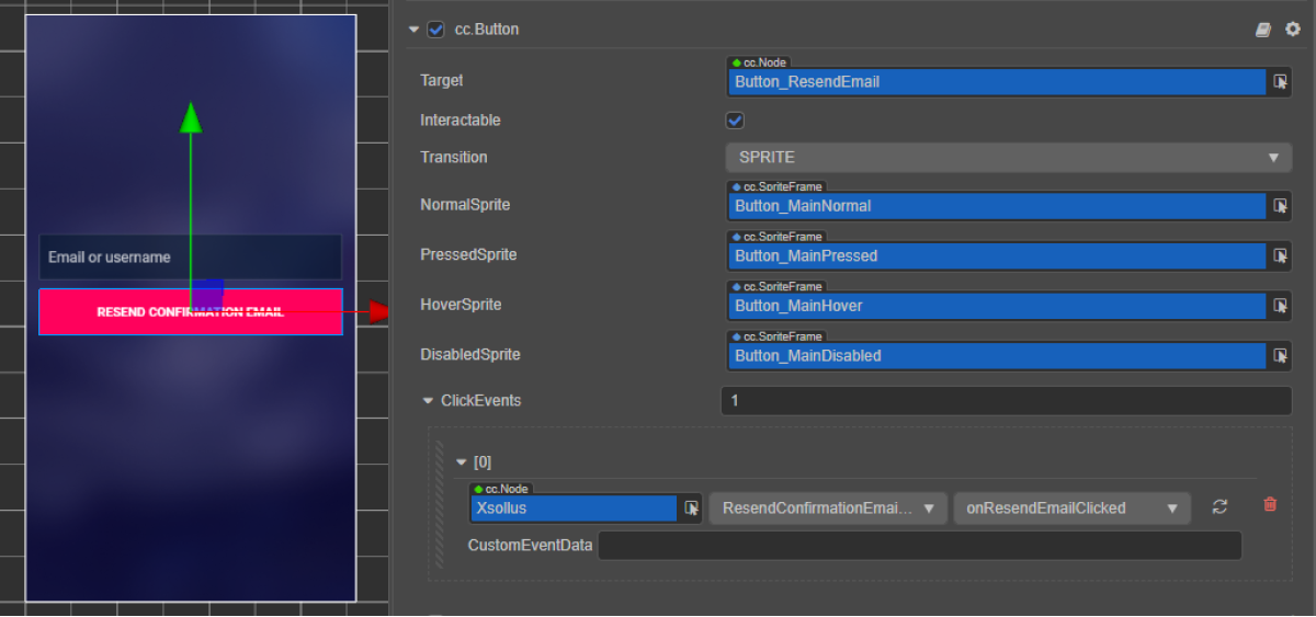
- 등록 확인 이메일 요청 버튼에 콜백 바인딩하는 방법:
- 아래 그림과 같이
Inspector 패널을 사용합니다. - 확인 이메일 재전송 요청이 있는 페이지의 스크립트에 아래의 코드 블록을 삽입합니다.
- 아래 그림과 같이
코드를 통한 바인딩 콜백:
- typescript
1start() {
2	this.resendEmailButton.node.on(Button.EventType.CLICK, this.onResendEmailClicked, this);
3  }
요청이 성공적이면 사용자가 등록 확인 이메일을 등록할 동안 지정한 이메일 주소로 받습니다.
스크립트 예시에서 onComplete 및 onError 메서드가 표준 console.log 메서드를 호출합니다. 다른 동작을 추가할 수 있습니다.
오류가 발생하면 오류 코드와 설명이 error 매개 변수에서 전달됩니다.
- typescript
 1import { _decorator, Button, Component, EditBox } from 'cc';
 2import { XsollaAuth } from 'db://xsolla-commerce-sdk/scripts/api/XsollaAuth';
 3const { ccclass, property } = _decorator;
 4
 5
 6@ccclass('ResendConfirmationEmailComponent')
 7export class ResendConfirmationEmailComponent extends Component {
 8
 9    @property(EditBox)
10    usernameEditBox: EditBox;
11
12    @property(Button)
13    resendEmailButton: Button;
14
15    start() {
16        this.resendEmailButton.node.on(Button.EventType.CLICK, this.onResendEmailClicked, this);
17    }
18
19    onResendEmailClicked() {
20        XsollaAuth.resendAccountConfirmationEmail(this.usernameEditBox.string, 'xsollatest', null, () => {
21            console.log('A verification link has been successfully sent to your email');
22        }, err => {
23            console.log(err);
24        });
25    }
26}
사용자 로그인 구현
이 튜토리얼이 설명하는 논리의 구현:

페이지 컨트롤러 생성
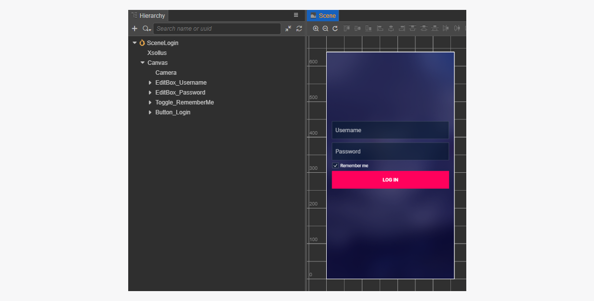
로그인 페이지용 장면을 생성하고 다음 요소 추가:
- 사용자 이름 필드
- 암호 필드
- 기억 토글
- 로그인 버튼
페이지 구조 예시:
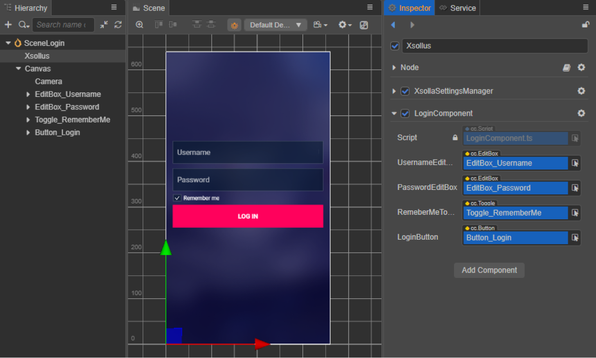
로그인 스크립트 구성 요소 생성
- LoginComponent 생성을 클릭한 후 다음 속성을 추가합니다.
usernameEditBoxpasswordEditBoxremeberMeToggleloginButton- 선택 사항입니다. 코드를 사용하여 콜백 함수를 버튼에 바인딩할 때 사용합니다.
- 스크립트 예시와 같이
LoginButton을 클릭할 때 호출되는 메서드를LoginComponent클래스에 추가하고, 클릭 이벤트를 처리하는 로직을 추가합니다. - 장면의 노드에 LoginComponent를 추가합니다. 새 노드를 추가하거나 SDK 초기화를 수행하는 동안 추가한
XsollaSettingsManager구성 요소가 있는 기존 노드를 사용할 수 있습니다. - 그림과 같이 장면 요소를
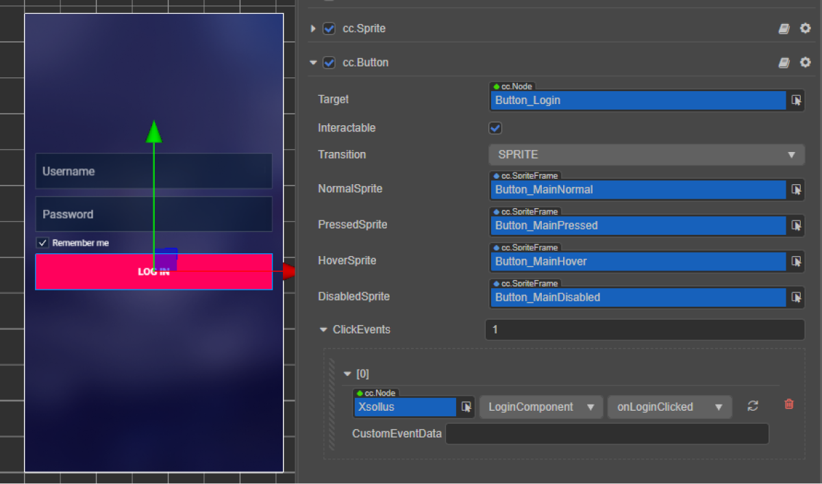
LoginComponent의 속성에 바인딩합니다.
- 다음 방법 중 하나를 사용하여 로그인 버튼에 콜백을 바인딩합니다.
- 아래 그림과 같이
Inspector 패널 사용 - 페이지 스크립트에 아래의 코드 블록 삽입
- 아래 그림과 같이
코드를 통한 바인딩 콜백:
- typescript
1start() {
2	 this.loginButton.node.on(Button.EventType.CLICK, this.onLoginClicked, this);
3  }
스크립트 예시에서 onComplete 및 onError 메서드가 표준 console.log 메서드를 호출합니다. 다른 동작을 추가할 수 있습니다.
오류가 발생하면 오류 코드와 설명이 error 매개 변수에서 전달됩니다.
- typescript
 1import { _decorator, Button, Component, EditBox, Toggle } from 'cc';
 2import { XsollaAuth } from 'db://xsolla-commerce-sdk/scripts/api/XsollaAuth';
 3const { ccclass, property } = _decorator;
 4
 5
 6@ccclass('LoginComponent')
 7export class LoginComponent extends Component {
 8
 9    @property(EditBox)
10    usernameEditBox: EditBox;
11
12    @property(EditBox)
13    passwordEditBox: EditBox;
14
15    @property(Toggle)
16    remeberMeToggle: Toggle;
17
18    @property(Button)
19    loginButton: Button;
20
21    start() {
22        this.loginButton.node.on(Button.EventType.CLICK, this.onLoginClicked, this);
23    }
24
25    onLoginClicked() {
26        XsollaAuth.authByUsernameAndPassword(this.usernameEditBox.string, this.passwordEditBox.string, this.remeberMeToggle.isChecked, token => {
27            console.log(`Successful login. Token - ${token.access_token}`);
28        }, err => {
29            console.log(err);
30        });
31    }
32}
암호 재설정 구현
이 튜토리얼이 설명하는 논리의 구현:

페이지 컨트롤러 생성
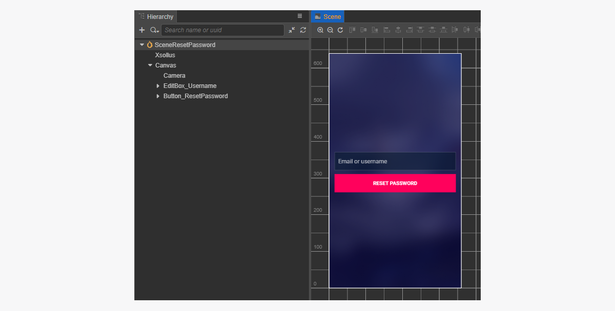
암호 재설정 페이지에 대한 장면을 만든 후 추가해야 하는 항목:
- 사용자 이름 필드
- 암호 재설정 버튼
페이지 구조 예시:
암호 재설정 스크립트 구성 요소 생성
- ResetPasswordComponent 생성을 수행한 후 다음 속성을 추가합니다.
usernameEditBoxresetPasswordButton- 선택 사항입니다. 코드를 사용하여 콜백 함수를 버튼에 바인딩할 때 사용합니다.
- 스크립트 예시와 같이
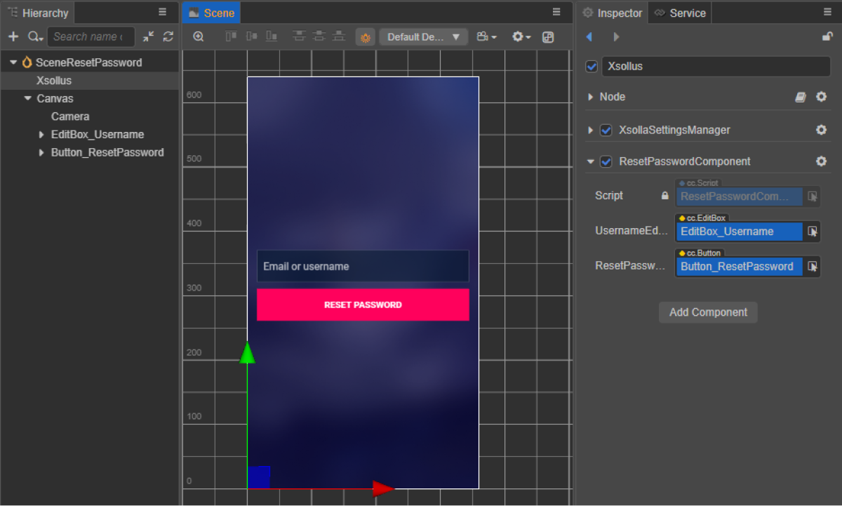
ResetPassword을 클릭할 때 호출되는 메서드를ResetPasswordComponent클래스에 추가하고, 클릭 이벤트를 처리하는 로직을 추가합니다. - 장면의 노드에 ResetPasswordComponent를 추가합니다. 새 노드를 추가하거나 SDK 초기화를 수행하는 동안 추가한
XsollaSettingsManager구성 요소가 있는 기존 노드를 사용할 수 있습니다. - 그림과 같이 장면 요소를
ResetPasswordComponent의 속성에 바인딩합니다.
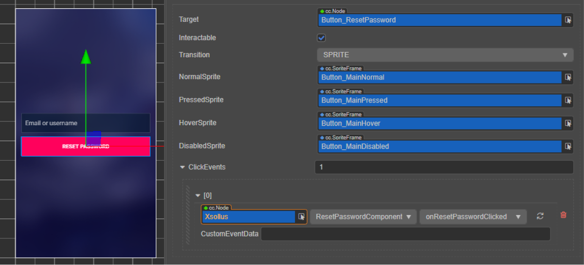
- 다음 방법 중 하나를 사용하여 암호 재설정 버튼에 콜백을 바인딩합니다.
- 아래 그림과 같이
Inspector 패널 사용 - 페이지 스크립트에 아래의 코드 블록 삽입
- 아래 그림과 같이
코드를 통한 바인딩 콜백:
- typescript
1start() {
2        this.resetPasswordButton.node.on(Button.EventType.CLICK, this.onResetPasswordClicked, this);
3    }
스크립트 예시에서 onComplete 및 onError 메서드가 표준 console.log 메서드를 호출합니다. 다른 동작을 추가할 수 있습니다.
오류가 발생하면 오류 코드와 설명이 error 매개 변수에서 전달됩니다.
- typescript
 1import { _decorator, Button, Component, EditBox } from 'cc';
 2import { XsollaAuth } from 'db://xsolla-commerce-sdk/scripts/api/XsollaAuth';
 3const { ccclass, property } = _decorator;
 4
 5
 6@ccclass('ResetPasswordComponent')
 7export class ResetPasswordComponent extends Component {
 8
 9    @property(EditBox)
10    usernameEditBox: EditBox;
11
12    @property(Button)
13    resetPasswordButton: Button;
14
15    start() {
16        this.resetPasswordButton.node.on(Button.EventType.CLICK, this.onResetPasswordClicked, this);
17    }
18
19    onResetPasswordClicked() {
20        XsollaAuth.resetPassword(this.usernameEditBox.string, null, () => {
21            console.log('Follow the instructions we sent to your email');
22        }, err => {
23            console.log(err);
24        });
25    }
26}
소셜 로그인
본 지침은 SDK 메서드를 통하여 사용자의 SNS 계정으로 사용자 등록 및 로그인을 구현하는 방법을 보여줍니다.
사용자 이름/사용자 이메일 주소 및 암호를 통한 사용자 인증과는 달리, 사용자 등록을 위한 별도의 로직을 구현할 필요가 없습니다. 사용자가 SNS를 통해 최초 로그인 하는 경우, 새 계정이 자동으로 생성됩니다.
여러분의 애플리케이션에서 대체 인증 메서드를 자체 구현한 경우, 다음 조건이 일치하면 해당 SNS 계정이 기존 사용자 계정에 자동으로 연결 됩니다.
- 사용자 이름/이메일 주소 및 암호로 가입한 사용자가 SNS 계정을 통해 애플리케이션에 로그인했습니다.
- SNS는 이메일 주소를 반환합니다.
- SNS의 사용자 이메일 주소가 애플리케이션에서 가입 시 사용한 이메일 주소와 동일합니다.
이 튜토리얼이 설명하는 논리의 구현:

Facebook 계정을 통해 사용자 로그인을 설정하는 방법을 보여주는 예시입니다. 모든 소셜 네트워크를 같은 압법으로 설정할 수 있습니다.
이 예시는 기본적인 SDK 메서드에 대해 소개합니다. 애플리케이션은 일반적으로 더 복잡한 인터페이스와 로직을 필요로 합니다.
페이지 컨트롤러 생성
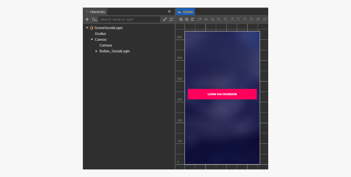
소셜 로그인 페이지용 장면을 생성하고 소셜 로그인 버튼을 이에 추가합니다.
페이지 구조 예시:
소셜 로그인 스크립트 구성 요소 생성
- SocialLoginComponent 생성. 코드를 사용하여 소셜 로그인 버튼에 콜백 함수를 바인딩하려면
socialLoginButton속성을 추가합니다. SocialLogin클릭 시 호출되는 메서드를SocialLoginComponent클래스에 추가하고, 스크립트 예시와 같이 클릭 이벤트를 처리하는 로직을 추가합니다.
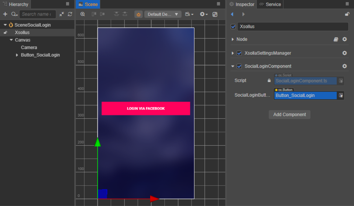
- 장면의 노드에 SocialLoginComponent를 추가합니다. 새 노드를 추가하거나 SDK 초기화를 수행하는 동안 추가한
XsollaSettingsManager구성 요소가 있는 기존 노드를 사용할 수 있습니다. - 그림과 같이
SocialLoginComponent의socialLoginButton속성에SocialLogin버튼을 바인딩합니다.
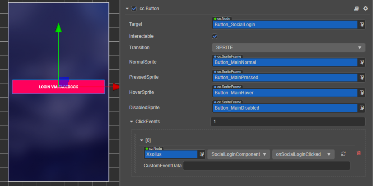
- 다음 방법 중 하나를 사용하여 로그인 버튼에 콜백을 바인딩합니다.
- 아래 그림과 같이
Inspector 패널 사용 - 페이지 스크립트에 아래의 코드 블록 삽입
- 아래 그림과 같이
코드를 통한 바인딩 콜백:
- typescript
1start() {
2        this.socialLoginButton.node.on(Button.EventType.CLICK, this.onSocialLoginClicked, this);
3}
스크립트 예시에서 onComplete, onCanceled 및 onError 메서드는 표준 console.log 메서드를 호출합니다. 오류가 발생하면 오류 코드 및 설명이 error 매개 변수에서 전달됩니다.
등록이 성공적이라면 등록 이메일 또는 로그인 페이지 열기 요청 재전송을 포함하는 페이지 열기 같은 다른 동작을 추가할 수 있습니다.
- typescript
 1import { _decorator, Button, Component } from 'cc';
 2import { Token, XsollaAuth } from '../../api/XsollaAuth';
 3const { ccclass, property } = _decorator;
 4
 5
 6namespace authorization {
 7
 8    @ccclass('SocialLoginComponent')
 9    export class SocialLoginComponent extends Component {
10
11        @property(Button)
12        socialLoginButton: Button;
13
14
15        start() {
16            this.socialLoginButton.node.on(Button.EventType.CLICK, this.onSocialLoginClicked, this);
17        }
18
19
20        onSocialLoginClicked() {
21            XsollaAuth.authSocial('facebook', (token: Token) => {
22                console.log(`Successful social authentication. Token - ${token.access_token}`);
23            }, () => {
24                console.log('Social auth was canceled');
25            }, (error:string) => {
26                console.log(error);
27            });
28        }
29    }
30}
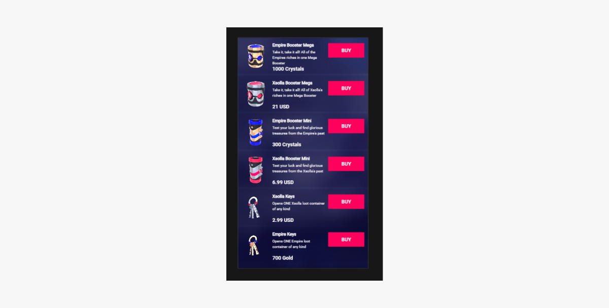
아이템 카탈로그 표시
이 튜토리얼은 SDK 메서드를 사용하여 인게임 스토어에서 다음 아이템을 표시하는 방법을 보여줍니다.
- 가상 아이템
- 번들
- 인게임 재화 패키지
시작하기 전에 관리자 페이지의 아이템을 구성해야 합니다.
이 튜토리얼이 설명하는 논리의 구현:

카탈로그의 모든 아이템 예시가 표시하는 내용:
- 이름
- 설명
- 가격
- 이미지
이 정보가 인게임 스토어에 정보가 저장되어 있다면 아이템에 관한 다른 정보도 표시할 수 있습니다.
가상 아이템 표시 구현
아이템 위젯 생성
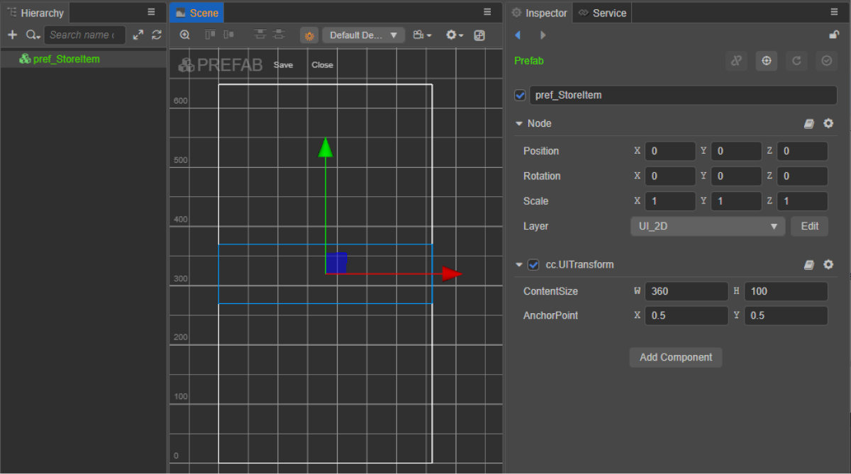
- 프리패브를 생성합니다. 이렇게 하려면 폴더의 컨텍스트 메뉴에서
Create > Node Prefab 를 선택합니다. - 생성된 프리패브를 엽니다.
- 아래 이미지와 같이 프리패브의 루트에
UITransform구성 요소를 추가하고 콘텐츠 크기를 설정합니다.
- 다음 UI 요소를 프리패브 하위 개체로 추가하고 해당하는 비주얼을 구성합니다.
- 위젯 배경 이미지
- 아이템 이름
- 아이템 설명
- 아이템 가격
- 아이템 이미지
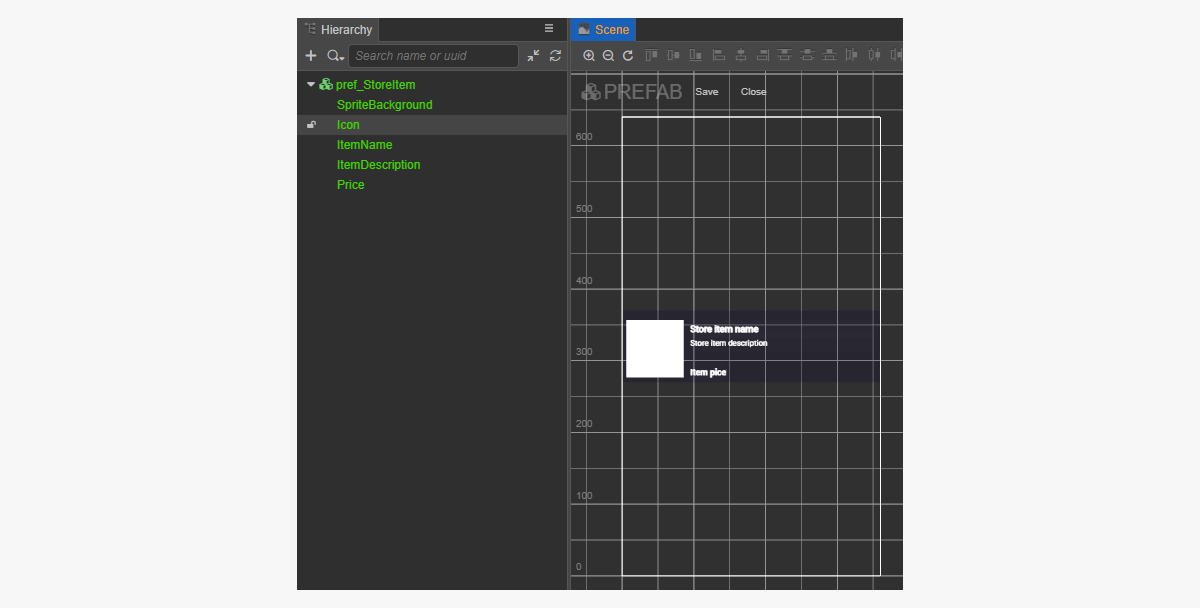
위젯 구조 예시:
아이템 위젯 스크립트 생성
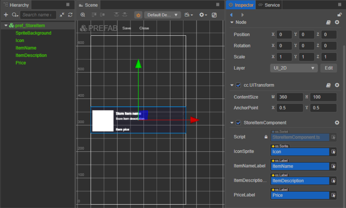
StoreItemComponent생성을 수행한 후 다음 속성을 추가합니다.iconSpriteitemNameLabelitemDescriptionLabelpriceLabel
- 스크립트 예시와 같이
init메서드와 초기화 로직을StoreItemComponent클래스에 추가합니다. - 스토어ItemComponent를 프리패브의 루트 노드에 연결합니다.
- 그림과 같이 프리패브 요소를
StoreItemComponent의 속성에 바인딩합니다.
위젯 스크립트 예시(스토어ItemComponent):
- typescript
 1import { _decorator, assetManager, Component, ImageAsset, Label, Sprite, SpriteFrame, Texture2D } from 'cc';
 2import { StoreItem } from 'db://xsolla-commerce-sdk/scripts/api/XsollaCatalog';
 3const { ccclass, property } = _decorator;
 4
 5
 6@ccclass('StoreItemComponent')
 7export class StoreItemComponent extends Component {
 8
 9    @property(Sprite)
10    iconSprite: Sprite;
11
12    @property(Label)
13    itemNameLabel: Label;
14
15    @property(Label)
16    itemDescriptionLabel: Label;
17
18    @property(Label)
19    priceLabel: Label;
20
21    private _data: StoreItem;
22
23    init(data: StoreItem) {
24
25        this._data = data;
26
27        this.itemNameLabel.string = data.name;
28        this.itemDescriptionLabel.string = data.description;
29
30        if (data.virtual_prices.length > 0) {
31            this.priceLabel.string = `${data.virtual_prices[0].amount.toString()} ${data.virtual_prices[0].name}`;
32        } else {
33            this.priceLabel.string = `${parseFloat(data.price.amount)} ${data.price.currency}`;
34        }
35
36        assetManager.loadRemote<ImageAsset>(data.image_url, (err, imageAsset) => {
37            if(err == null) {
38            const spriteFrame = new SpriteFrame();
39            const texture = new Texture2D();
40            texture.image = imageAsset;
41            spriteFrame.texture = texture;
42            this.iconSprite.spriteFrame = spriteFrame;
43            } else {
44                console.log(`Can’t load image with URL ${data.image_url}`);
45            }
46        });
47    }
48}
페이지 컨트롤러 생성
아이템 카탈로그 페이지에 대한 장면을 생성하고 ScrollView 요소를 추가합니다.
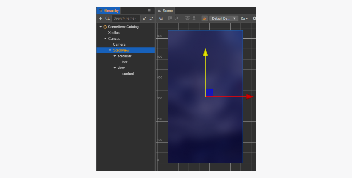
페이지 구조 예시:
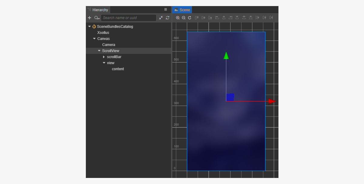
생성된 StoreItem 프리패브와 일치하는 ScrollView를 만들기 위해 크기를 설정하는 방법:
ScrollView노드와 내부view노드에서ContentSize매개 변수 값을 변경합니다.Layout구성 요소를content노드에 바인딩하고 이를 설정합니다. 예시에서는 다음과 같은 설정이 선택되어 있습니다.Type == verticalResizeMode == Container
아이템 카탈로그 스크립트 구성 요소 생성
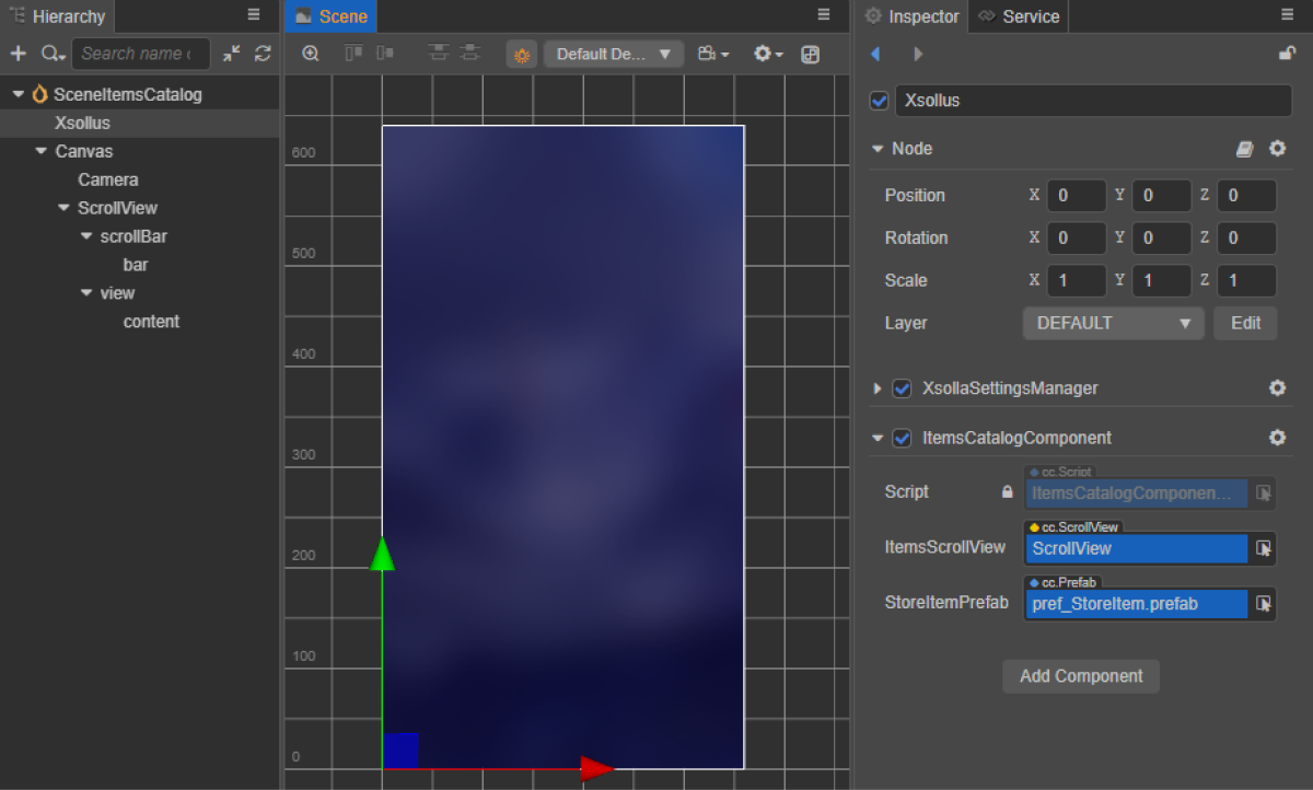
- ItemsCatalogComponent 생성 작업을 수행한 후 다음 속성을 추가합니다.
itemsScrollViewStoreItemPrefab
- 스크립트 예시와 같이
start 수명 주기 함수와 초기화 로직을ItemsCatalogComponent클래스에 추가합니다. - 장면의 노드에 ItemsCatalogComponent를 추가합니다. 새 노드를 추가하거나 SDK 초기화를 수행하는 동안 추가한
XsollaSettingsManager구성 요소가 있는 기존 노드를 사용할 수 있습니다. - 그림과 같이 프리패브 요소를
ItemsCatalogComponent의 속성에 바인딩합니다.
클래스 스크립트 예시(ItemsCatalogComponent):
- typescript
 1import { _decorator, Component, instantiate, Prefab, ScrollView } from 'cc';
 2import { XsollaCatalog } from 'db://xsolla-commerce-sdk/scripts/api/XsollaCatalog';
 3import { StoreItemComponent } from './StoreItemComponent';
 4const { ccclass, property } = _decorator;
 5
 6
 7@ccclass('ItemsCatalogComponent')
 8export class ItemsCatalogComponent extends Component {
 9
10    @property(ScrollView)
11    itemsScrollView: ScrollView;
12
13    @property(Prefab)
14    storeItemPrefab: Prefab;
15
16    start() {
17        XsollaCatalog.getCatalog(null, null, [], itemsData => {
18            for (let i = 0; i < itemsData.items.length; ++i) {
19                let storeItem = instantiate(this.storeItemPrefab);
20                this.itemsScrollView.content.addChild(storeItem);
21                storeItem.getComponent(StoreItemComponent).init(itemsData.items[i]);
22            }
23        });
24    }
25}
스크립트 작업 결과 예시:
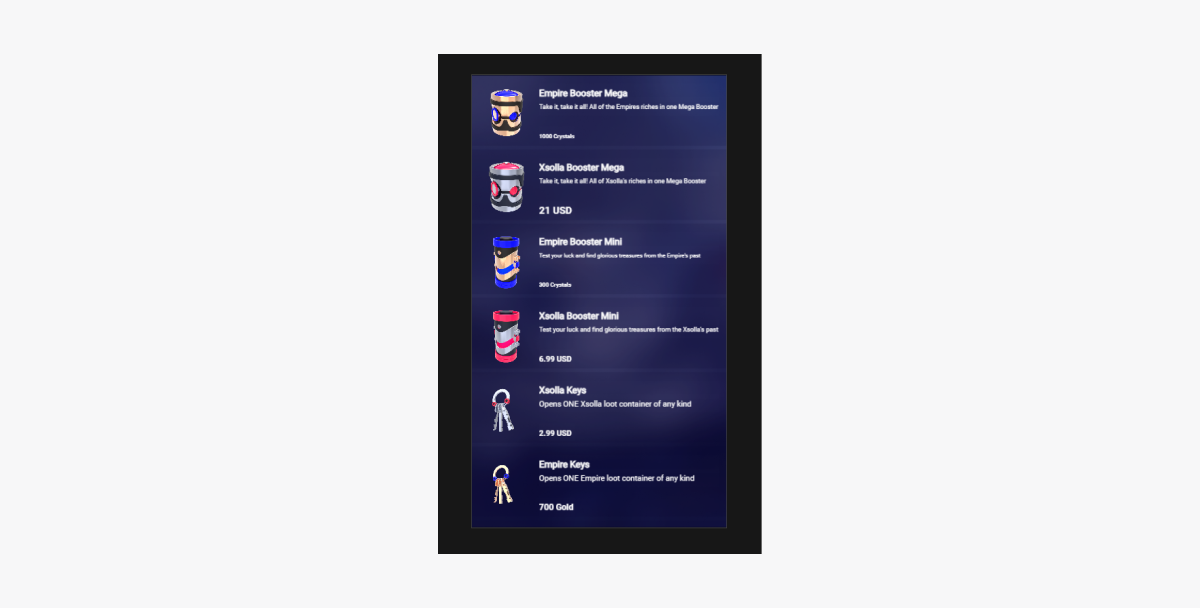
번들 표시 구현
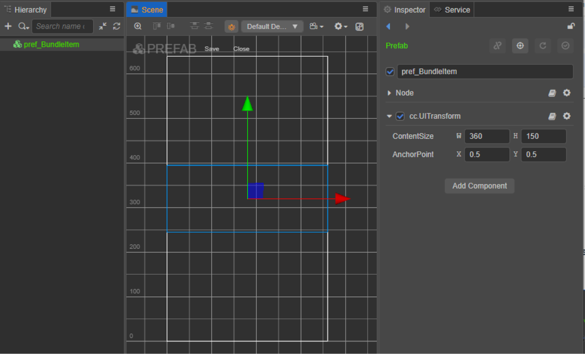
번들 위젯 생성
- 프리패브를 생성합니다. 이렇게 하려면 폴더의 컨텍스트 메뉴에서
Create > Node Prefab 를 선택합니다. - 생성된 프리패브를 엽니다.
- 아래 이미지와 같이 프리패브의 루트에
UITransform구성 요소를 추가하고 콘텐츠 크기를 설정합니다.
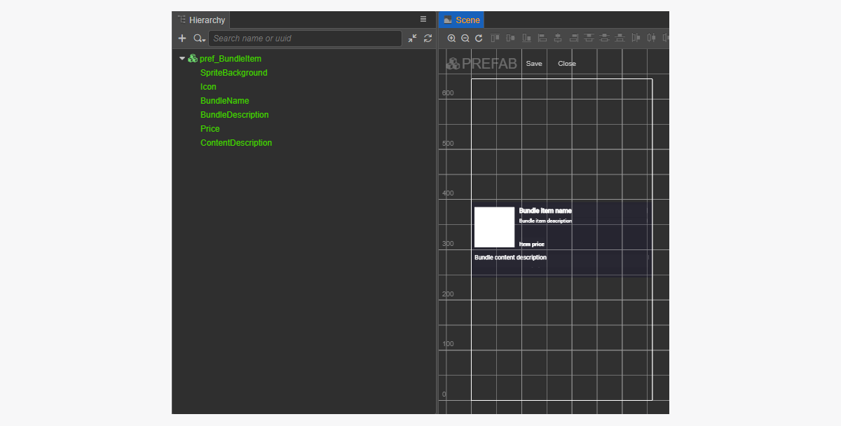
- 다음 UI 요소를 프리패브 하위 개체로 추가하고 해당하는 비주얼을 구성합니다.
- 위젯 배경 이미지
- 번들 이름
- 번들 설명
- 번들 가격
- 번들 이미지
- 번들 콘텐츠 설명(아이템 및 해당 수량)
위젯 구조 예시:
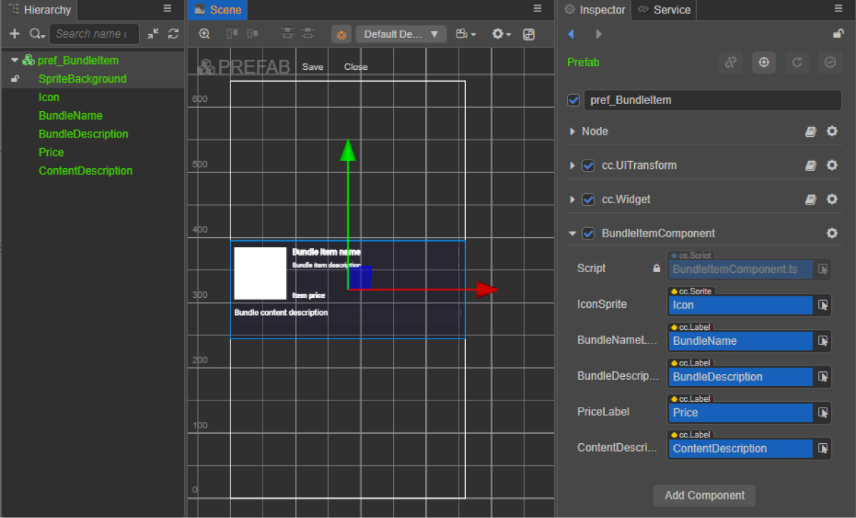
번들 위젯 스크립트 생성
- BundleItemComponent 생성을 수행한 후 다음 속성을 추가합니다.
iconSpritebundleNameLabelbundleDescriptionLabelpriceLabelcontentDescriptionlabel
- 스크립트 예시와 같이
init메서드와 초기화 로직을BundleItemComponent클래스에 추가합니다. - BundleItemComponent를 프리패브의 루트 노드에 연결합니다.
- 그림과 같이 프리패브 요소를
BundleItemComponent의 속성에 바인딩합니다.
위젯 스크립트 예시(BundleItemComponent):
- typescript
 1import { _decorator, assetManager, Component, ImageAsset, Label, Sprite, SpriteFrame, Texture2D } from 'cc';
 2import { StoreBundle } from 'db://xsolla-commerce-sdk/scripts/api/XsollaCatalog';
 3const { ccclass, property } = _decorator;
 4
 5
 6@ccclass('BundleItemComponent')
 7export class BundleItemComponent extends Component {
 8
 9    @property(Sprite)
10    iconSprite: Sprite;
11
12    @property(Label)
13    bundleNameLabel: Label;
14
15    @property(Label)
16    bundleDescriptionLabel: Label;
17
18    @property(Label)
19    priceLabel: Label;
20
21    @property(Label)
22    contentDescriptionLabel: Label;
23
24    init(data: StoreBundle) {
25
26        this.bundleNameLabel.string = data.name;
27        this.bundleDescriptionLabel.string = data.description;
28
29        if (data.virtual_prices.length > 0) {
30            this.priceLabel.string = `${data.virtual_prices[0].amount.toString()} ${data.virtual_prices[0].name}`;
31        } else {
32            this.priceLabel.string = `${parseFloat(data.price.amount)} ${data.price.currency}`;
33        }
34
35        assetManager.loadRemote<ImageAsset>(data.image_url, (err, imageAsset) => {
36            if(err == null) {
37            const spriteFrame = new SpriteFrame();
38            const texture = new Texture2D();
39            texture.image = imageAsset;
40            spriteFrame.texture = texture;
41            this.iconSprite.spriteFrame = spriteFrame;
42            } else {
43                console.log(`Can’t load image with URL ${data.image_url}`);
44            }
45        });
46
47        this.contentDescriptionLabel.string = `This bundle includes ${data.content.length} items: `;
48        var bandles = data.content.map(bundle => bundle.name).join(', ');
49        this.contentDescriptionLabel.string += bandles;
50    }
51}
페이지 컨트롤러 생성
번들 카탈로그 페이지에 대한 장면을 생성하고 ScrollView 요소를 추가합니다.
페이지 구조 예시:
생성된 BundleItem 프리패브와 일치하는 ScrollView를 만들기 위해 크기를 설정하는 방법:
ScrollView노드와 내부view노드에서ContentSize매개 변수 값을 변경합니다.Layout구성 요소를content노드에 바인딩하고 이를 설정합니다. 예시에서는 다음과 같은 설정이 선택되어 있습니다.Type == verticalResizeMode == Container
번들 카탈로그 스크립트 구성 요소 생성
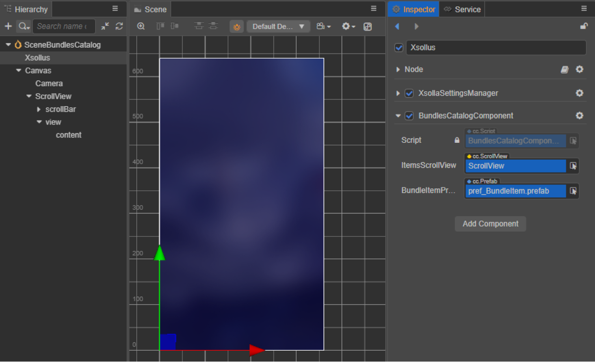
- BundlesCatalogComponent를 생성하고 다음 속성을 추가합니다.
itemsScrollViewbundleItemPrefab
- 스크립트 예시와 같이
start 수명 주기 함수와 초기화 로직을BundlesCatalogComponent클래스에 추가합니다. - 장면의 노드에 BundlesCatalogComponent를 추가합니다. 새 노드를 추가하거나 SDK 초기화를 수행하는 동안 추가한
XsollaSettingsManager구성 요소가 있는 기존 노드를 사용할 수 있습니다. - 그림과 같이 프리패브 요소를
BundlesCatalogComponent의 속성에 바인딩합니다.
클래스 스크립트 예시(BundlesCatalogComponent):
- typescript
 1import { _decorator, Component, instantiate, Prefab, ScrollView } from 'cc';
 2import { XsollaCatalog } from 'db://xsolla-commerce-sdk/scripts/api/XsollaCatalog';
 3import { BundleItemComponent } from './BundleItemComponent';
 4const { ccclass, property } = _decorator;
 5
 6
 7@ccclass('BundlesCatalogComponent')
 8export class BundlesCatalogComponent extends Component {
 9
10    @property(ScrollView)
11    itemsScrollView: ScrollView;
12
13    @property(Prefab)
14    bundleItemPrefab: Prefab;
15
16    start() {
17        XsollaCatalog.getBundleList(null, null, [], itemsData => {
18        for (let i = 0; i < itemsData.items.length; ++i) {
19                let bundleItem = instantiate(this.bundleItemPrefab);
20                this.itemsScrollView.content.addChild(bundleItem);
21                bundleItem.getComponent(BundleItemComponent).init(itemsData.items[i]);
22            }
23        });
24    }
25}
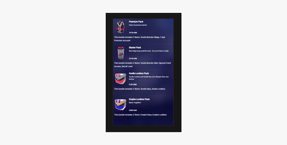
스크립트 작업 결과 예시:
인게임 재화 패키지 카탈로그 표시 구현
인게임 재화 패키지용 위젯 생성
- 프리패브를 생성합니다. 이렇게 하려면 폴더의 컨텍스트 메뉴에서
Create > Node Prefab 를 선택합니다. - 생성된 프리패브를 엽니다.
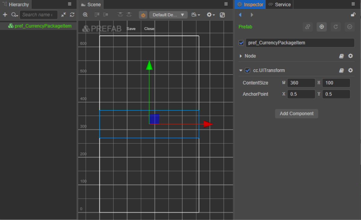
- 아래 이미지와 같이 프리패브의 루트에
UITransform구성 요소를 추가하고 콘텐츠 크기를 설정합니다.
- 다음 UI 요소를 프리패브 하위 개체로 추가하고 해당하는 비주얼을 구성합니다.
- 위젯 배경 이미지
- 인게임 재화 이름
- 인게임 재화 설명
- 인게임 재화 가격
- 인게임 재화 이미지
위젯 구조 예시:
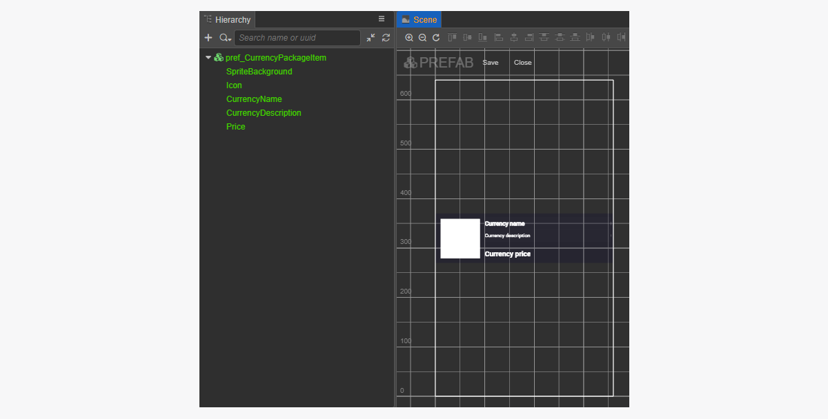
인게임 재화 패키지용 위젯 스크립트 생성
- CurrencyPackageItemComponent 생성을 수행한 후 다음 속성을 추가합니다.
iconSpritecurrencyNameLabelcurrencyDescriptionLabelpriceLabel
- 스크립트 예시와 같이
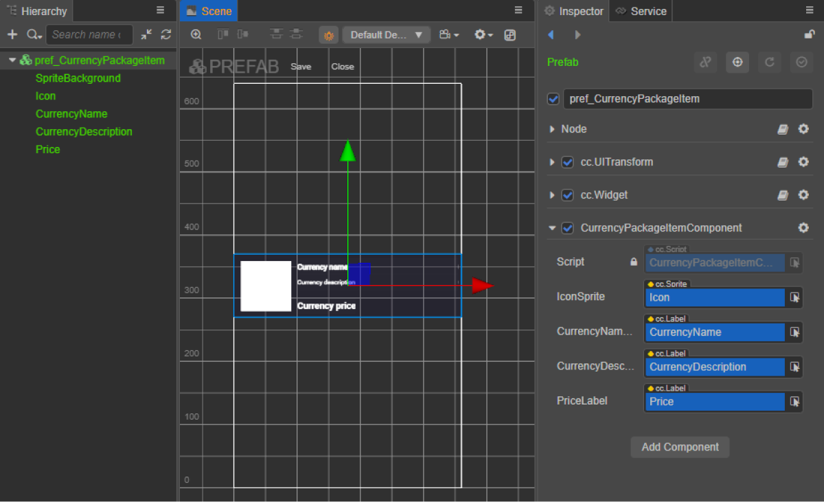
init메서드와 초기화 로직을CurrencyPackageItemComponent클래스에 추가합니다. - CurrencyPackageItemComponent를 프리패브의 루트 노드에 연결합니다.
- 그림과 같이 프리패브 요소를
CurrencyPackageItemComponent의 속성에 바인딩합니다.
위젯 스크립트 예시(CurrencyPackageItemComponent):
- typescript
 1import { _decorator, assetManager, Component, ImageAsset, Label, Sprite, SpriteFrame, Texture2D } from 'cc';
 2import { VirtualCurrencyPackage } from 'db://xsolla-commerce-sdk/scripts/api/XsollaCatalog';
 3const { ccclass, property } = _decorator;
 4
 5
 6@ccclass('CurrencyPackageItemComponent')
 7export class CurrencyPackageItemComponent extends Component {
 8
 9    @property(Sprite)
10    iconSprite: Sprite;
11
12    @property(Label)
13    currencyNameLabel: Label;
14
15    @property(Label)
16    currencyDescriptionLabel: Label;
17
18    @property(Label)
19    priceLabel: Label;
20
21    init(data: VirtualCurrencyPackage) {
22
23        this.currencyNameLabel.string = data.name;
24        this.currencyDescriptionLabel.string = data.description;
25
26        if (data.virtual_prices.length > 0) {
27            this.priceLabel.string = `${data.virtual_prices[0].amount.toString()} ${data.virtual_prices[0].name}`;
28        } else {
29            this.priceLabel.string = `${parseFloat(data.price.amount)} ${data.price.currency}`;
30        }
31
32        assetManager.loadRemote<ImageAsset>(data.image_url, (err, imageAsset) => {
33            if(err == null) {
34            const spriteFrame = new SpriteFrame();
35            const texture = new Texture2D();
36            texture.image = imageAsset;
37            spriteFrame.texture = texture;
38            this.iconSprite.spriteFrame = spriteFrame;
39            } else {
40                console.log(`Can’t load image with URL ${data.image_url}`);
41            }
42        });
43    }
44}
페이지 컨트롤러 생성
인게임 재화 패키지 카탈로그 페이지에 대한 장면을 생성하고 ScrollView 요소를 추가합니다.
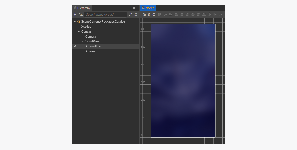
페이지 구조 예시:
생성된 CurrencyPackageItem 프리패브와 일치하는 ScrollView를 만들기 위해 크기를 설정하는 방법:
ScrollView노드와 내부view노드에서ContentSize매개 변수 값을 변경합니다.Layout구성 요소를content노드에 바인딩하고 이를 설정합니다. 예시에서는 다음과 같은 설정이 선택되어 있습니다.Type == verticalResizeMode == Container
통화 패키지 카탈로그 스크립트 구성 요소 생성
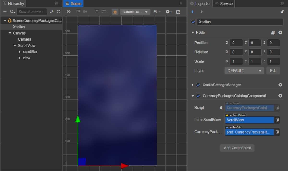
CurrencyPackagesCatalogComponent를 생성하고 다음 속성을 추가합니다.itemsScrollViewcurrencyPackageItemPrefab
- 스크립트 예시와 같이
start 수명 주기 함수와 초기화 로직을CurrencyPackagesCatalogComponent클래스에 추가합니다. - 장면의 노드에 CurrencyPackagesCatalogComponent를 추가합니다. 새 노드를 추가하거나 SDK 초기화를 수행하는 동안 추가한
XsollaSettingsManager구성 요소가 있는 기존 노드를 사용할 수 있습니다. - 그림과 같이 프리패브 요소를
CurrencyPackagesCatalogComponent의 속성에 바인딩합니다.
클래스 스크립트 예시(CurrencyPackagesCatalogComponent):
 1import { _decorator, Component, instantiate, Prefab, ScrollView } from 'cc';
 2import { XsollaCatalog } from 'db://xsolla-commerce-sdk/scripts/api/XsollaCatalog';
 3import { CurrencyPackageItemComponent } from './CurrencyPackageItemComponent';
 4const { ccclass, property } = _decorator;
 5
 6
 7@ccclass('CurrencyPackagesCatalogComponent')
 8export class CurrencyPackagesCatalogComponent extends Component {
 9
10    @property(ScrollView)
11    itemsScrollView: ScrollView;
12
13    @property(Prefab)
14    currencyPackageItemPrefab: Prefab;
15
16    start() {
17        XsollaCatalog.getVirtualCurrencyPackages(null, null, [], itemsData => {
18        for (let i = 0; i < itemsData.items.length; ++i) {
19                let currencyPackageItem = instantiate(this.currencyPackageItemPrefab);
20                this.itemsScrollView.content.addChild(currencyPackageItem);
21                currencyPackageItem.getComponent(CurrencyPackageItemComponent).init(itemsData.items[i]);
22            }
23        });
24    }
25}
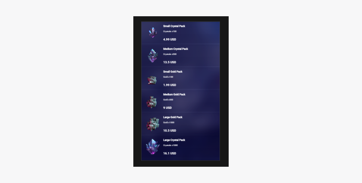
스크립트 작업 결과 예시:
실질 화폐용 가상 아이템 판매
이 섹션에서는 가상 아이템을 사용하여 실제 화폐로 아이템 판매하기를 구현할 수 있도록 SDK 메서드를 사용하는 방식을 설명합니다.
시작하기 전에 카탈로그에서 가상 아이템 표시 구현 작업을 수행합니다. 다음 예에서는 가상 아이템 구매 구현 방법을 설명합니다. 다른 아이템 유형용 구성은 이와 유사합니다.
이 튜토리얼이 설명하는 논리의 구현:

로그인 스크립트 예시에서 저희는 데모 계정 자격 증명을 사용합니다(사용자 이름 : xsolla, 암호: xsolla). 이 데모 계정은 데모 프로젝트에만 사용할 수 있습니다.
스크립트 샘플에는 카탈로그에 있는 아이템의 페이지별 표시 구현(페이지 매김)이 포함되어 있지 않습니다. 페이지 매김을 구현하려면 getCatalog SDK 메서드의 offset 및 limit 매개 변수를 사용합니다. 한 페이지 당 최대 아이템 개수는 50개입니다. 카탈로그에 아이템이 50개 이상 있는 경우 페이지 매김이 필요합니다.
전체 아이템 위젯
아이템 위젯에 구매 버튼을 추가하고 이 버튼의 시각적 정보를 구성합니다.
RC_StoreItemComponent로 변경됩니다.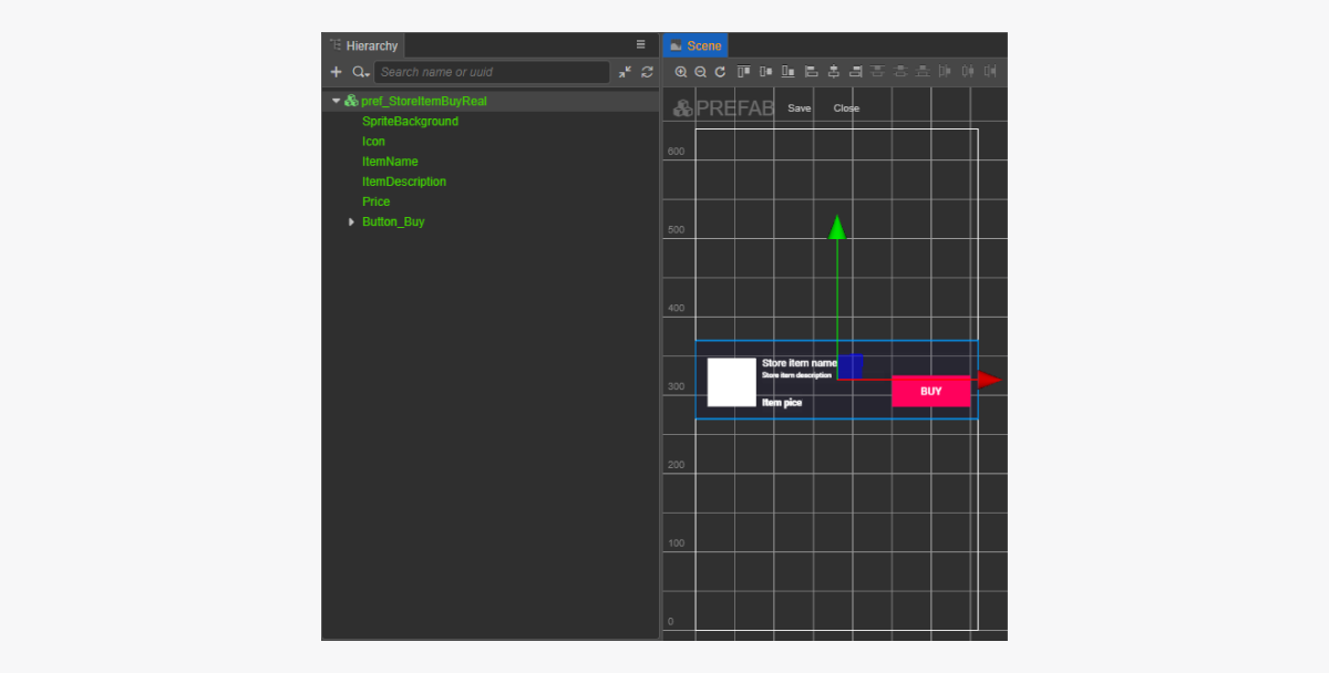
아이템 위젯 스크립트 완료
- 코드를 사용하여 콜백 함수를 구매 버튼에 바인딩하려면
RC_StoreItemComponent에buyButton속성을 추가합니다. - 스크립트 예시와 같이
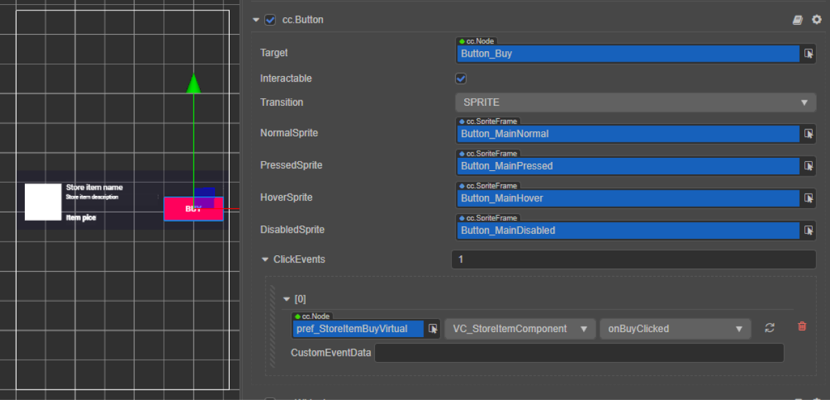
BuyButton클릭 시 호출되는 메서드를RC_StoreItemComponent클래스에 추가하고 클릭 이벤트를 처리하는 로직을 추가합니다. - 다음 방식 중 하나를 사용하여 구매 버튼에 콜백 바인딩 작업을 수행합니다.
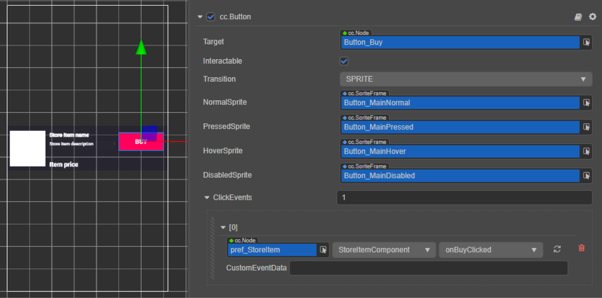
- 아래 그림과 같이
Inspector 패널 사용 - 페이지 스크립트에 아래 코드 블록 삽입
- 아래 그림과 같이
코드를 통한 바인딩 콜백:
- typescript
1start() {
2	this.buyButton.node.on(Button.EventType.CLICK, this.onBuyClicked, this);
3  }
위젯 스크립트 예시(RC_스토어ItemComponent):
- typescript
 1import { _decorator, assetManager, Button, Component, ImageAsset, Label, Sprite, SpriteFrame, Texture2D } from 'cc';
 2import { StoreItem, XsollaCatalog } from '../../api/XsollaCatalog';
 3import { TokenStorage } from '../../common/TokenStorage';
 4import { OrderTracker } from '../../common/OrderTracker';
 5import { XsollaPayments } from '../../api/XsollaPayments';
 6const { ccclass, property } = _decorator;
 7
 8
 9export namespace sellForRealMoneyItem {
10
11
12    @ccclass('RC_StoreItemComponent')
13    export class RC_StoreItemComponent extends Component {
14
15
16        @property(Sprite)
17        iconSprite: Sprite;
18
19
20        @property(Label)
21        itemNameLabel: Label;
22
23
24        @property(Label)
25        itemDescriptionLabel: Label;
26
27
28        @property(Label)
29        priceLabel: Label;
30
31
32        @property(Button)
33        buyButton: Button;
34
35
36        private _data: StoreItem;
37
38
39        start() {
40            this.buyButton.node.on(Button.EventType.CLICK, this.onBuyClicked, this);
41        }
42
43
44        init(data: StoreItem) {
45
46            this._data = data;
47
48
49            this.itemNameLabel.string = data.name;
50            this.itemDescriptionLabel.string = data.description;
51
52            if (data.virtual_prices.length > 0) {
53                this.priceLabel.string = `${data.virtual_prices[0].amount.toString()} ${data.virtual_prices[0].name}`;
54            } else {
55                this.priceLabel.string = `${parseFloat(data.price.amount)} ${data.price.currency}`;
56            }
57
58
59            assetManager.loadRemote<ImageAsset>(data.image_url, (err, imageAsset) => {
60                if(err == null) {
61                const spriteFrame = new SpriteFrame();
62                const texture = new Texture2D();
63                texture.image = imageAsset;
64                spriteFrame.texture = texture;
65                this.iconSprite.spriteFrame = spriteFrame;
66                } else {
67                    console.log(`Cant load image with url ${data.image_url}`);
68                }
69            });
70        }
71
72
73        onBuyClicked() {
74            XsollaCatalog.fetchPaymentToken(TokenStorage.getToken().access_token, this._data.sku, 1, undefined, undefined, undefined, undefined, undefined, result => {
75                OrderTracker.checkPendingOrder(result.token, result.orderId, () => {
76                    console.log('success purchase!');
77                }, error => {
78                    console.log(`Order checking failed - Status code: ${error.status}, Error code: ${error.code}, Error message: ${error.description}`);
79                });
80                XsollaPayments.openPurchaseUI(result.token);
81            }, error => {
82                console.log(error.description);
83            });
84        }
85    }
86}
전체 아이템 카탈로그 스크립트 구성 요소
RC_ItemsCatalogComponent로 변경됩니다.스크립트 예시에 표시된 것처럼 RC_ItemsCatalogComponent 클래스의 start 메서드로 유효한 인증 토큰을 가져오기 위한 로직을 추가합니다.
클래스 스크립트 예시(RC_ItemsCatalogComponent):
- typescript
 1import { _decorator, Component, instantiate, Prefab, ScrollView } from 'cc';
 2import { XsollaCatalog } from 'db://xsolla-commerce-sdk/scripts/api/XsollaCatalog';
 3import { RC_StoreItemComponent } from './RC_StoreItemComponent';
 4import { XsollaAuth } from 'db://xsolla-commerce-sdk/scripts/api/XsollaAuth';
 5import { TokenStorage } from 'db://xsolla-commerce-sdk/scripts/common/TokenStorage';
 6const { ccclass, property } = _decorator;
 7
 8
 9
10
11@ccclass('RC_ItemsCatalogComponent')
12export class RC_ItemsCatalogComponent extends Component {
13
14    @property(ScrollView)
15    itemsScrollView: ScrollView;
16
17
18    @property(Prefab)
19    storeItemPrefab: Prefab;
20
21
22    start() {
23        XsollaAuth.authByUsernameAndPassword('xsolla', 'xsolla', false, token => {
24            TokenStorage.saveToken(token, false);
25            XsollaCatalog.getCatalog(null, null, [], itemsData => {
26                for (let i = 0; i < itemsData.items.length; ++i) {
27                        let storeItem = instantiate(this.storeItemPrefab);
28                        this.itemsScrollView.content.addChild(storeItem);
29                        storeItem.getComponent(RC_StoreItemComponent).init(itemsData.items[i]);
30                    }
31                });
32        });
33    }
34}
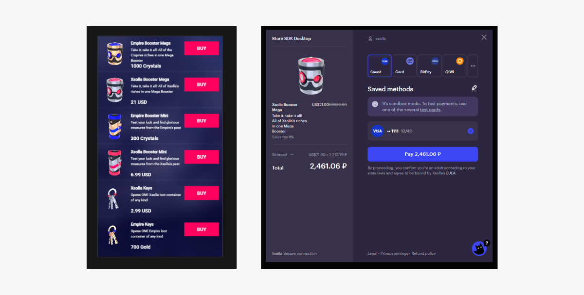
스크립트 작업 결과 예시:
인게임 재화용 가상 아이템 판매
이 섹션에서는 가상 아이템을 사용하여 인게임 재화로 아이템 판매하기를 구현할 수 있도록 SDK 메서드를 사용하는 방식을 설명합니다.
시작하기 전에 카탈로그의 가상 아이템 표시를 구현합니다. 다음 예에서는 가상 아이템 구매 구현 방법을 설명합니다. 다른 아이템 유형용 구성은 이와 유사합니다.
이 튜토리얼이 설명하는 논리의 구현:

로그인 스크립트 예시에서 저희는 데모 계정 자격 증명을 사용합니다(사용자 이름 : xsolla, 암호: xsolla). 이 데모 계정은 데모 프로젝트에만 사용할 수 있습니다.
스크립트 샘플에는 카탈로그에 있는 아이템의 페이지별 표시 구현(페이지 매김)이 포함되어 있지 않습니다. 페이지 매김을 구현하려면 getCatalog SDK 메서드의 offset 및 limit 매개 변수를 사용합니다. 한 페이지 당 최대 아이템 개수는 50개입니다. 카탈로그에 아이템이 50개 이상 있는 경우 페이지 매김이 필요합니다.
아이템 위젯 완료
아이템 위젯에 구매 버튼을 추가하고 이 버튼의 시각적 정보를 구성합니다.
VC_StoreItemComponent로 변경됩니다.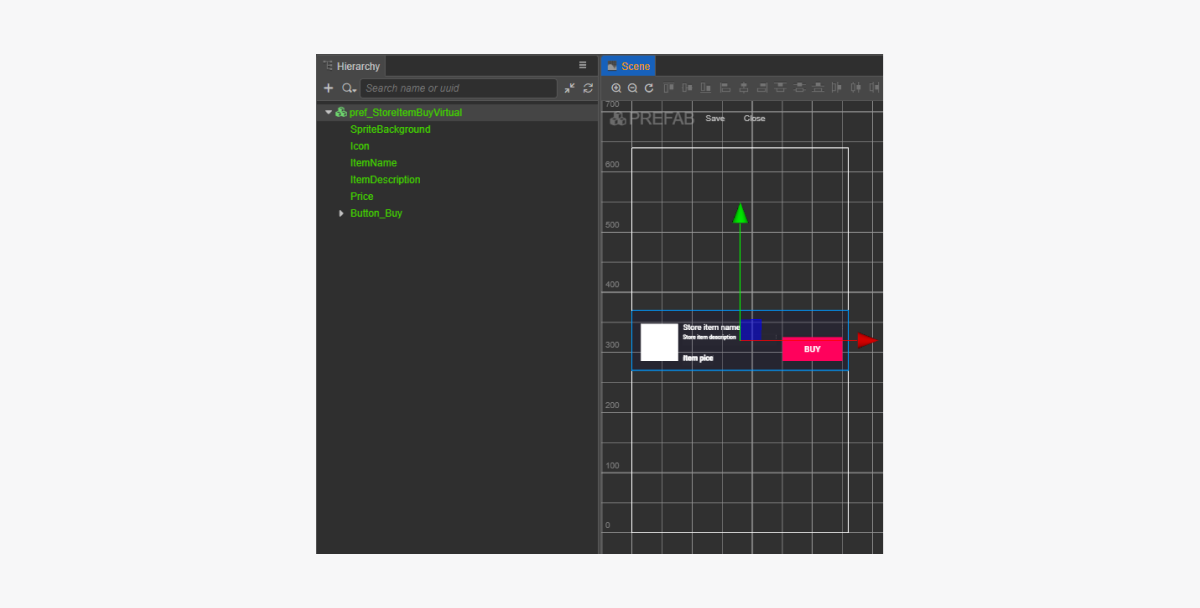
아이템 위젯 스크립트 완료
- 코드를 사용하여 콜백 함수를 구매 버튼에 바인딩하려면
VC_StoreItemComponent에buyButton속성을 추가합니다. - 스크립트 예시와 같이
BuyButton클릭 시 호출되는 메서드를VC_StoreItemComponent클래스에 추가하고 클릭 이벤트를 처리하는 로직을 추가합니다. - 다음 방식 중 하나를 사용하여 구매 버튼에 콜백 바인딩 작업을 수행합니다.
- 아래 그림과 같이
Inspector 패널 사용 - 페이지 스크립트에 아래 코드 블록 삽입
- 아래 그림과 같이
코드를 통한 바인딩 콜백:
- typescript
1start() {
2	this.buyButton.node.on(Button.EventType.CLICK, this.onBuyClicked, this);
3  }
위젯 스크립트 예시(VC_스토어ItemComponent):
- typescript
 1import { _decorator, assetManager, Button, Component, ImageAsset, Label, Sprite, SpriteFrame, Texture2D } from 'cc';
 2import { StoreItem, XsollaCatalog } from 'db://xsolla-commerce-sdk/scripts/api/XsollaCatalog';
 3import { TokenStorage } from 'db://xsolla-commerce-sdk/scripts/common/TokenStorage';
 4import { OrderTracker } from 'db://xsolla-commerce-sdk/scripts/common/OrderTracker';
 5const { ccclass, property } = _decorator;
 6
 7
 8@ccclass('VC_StoreItemComponent')
 9export class VC_StoreItemComponent extends Component {
10
11    @property(Sprite)
12    iconSprite: Sprite;
13
14    @property(Label)
15    itemNameLabel: Label;
16
17    @property(Label)
18    itemDescriptionLabel: Label;
19
20    @property(Label)
21    priceLabel: Label;
22
23    @property(Button)
24    buyButton: Button;
25
26    private _data: StoreItem;
27
28    start() {
29        this.buyButton.node.on(Button.EventType.CLICK, this.onBuyClicked, this);
30    }
31
32    init(data: StoreItem) {
33
34        this._data = data;
35
36        this.itemNameLabel.string = data.name;
37        this.itemDescriptionLabel.string = data.description;
38
39        if (data.virtual_prices.length > 0) {
40            this.priceLabel.string = `${data.virtual_prices[0].amount.toString()} ${data.virtual_prices[0].name}`;
41        } else {
42            this.priceLabel.string = `${parseFloat(data.price.amount)} ${data.price.currency}`;
43        }
44
45        assetManager.loadRemote<ImageAsset>(data.image_url, (err, imageAsset) => {
46            if(err == null) {
47            const spriteFrame = new SpriteFrame();
48            const texture = new Texture2D();
49            texture.image = imageAsset;
50            spriteFrame.texture = texture;
51            this.iconSprite.spriteFrame = spriteFrame;
52            } else {
53                console.log(`Can’t load image with URL ${data.image_url}`);
54            }
55        });
56    }
57
58    onBuyClicked() {
59        XsollaCatalog.purchaseItemForVirtualCurrency(TokenStorage.getToken().access_token, this._data.sku, this._data.virtual_prices[0].sku, orderId => {
60            OrderTracker.checkPendingOrder(TokenStorage.getToken().access_token, orderId, () => {
61                console.log('success purchase!');
62            }, error => {
63                console.log(`Order checking failed - Status code: ${error.status}, Error code: ${error.code}, Error message: ${error.description}`);
64            });
65        }, error => {
66            console.log(error.description);
67        });
68    }
69}
전체 아이템 카탈로그 스크립트 구성 요소
VC_ItemsCatalogComponent로 변경됩니다.스크립트 예시에 표시된 것처럼 VC_ItemsCatalogComponent 클래스의 start 메서드로 유효한 인증 토큰을 가져오기 위한 로직을 추가합니다.
클래스 스크립트 예시(VC_ItemsCatalogComponent):
- typescript
 1import { _decorator, Component, instantiate, Prefab, ScrollView } from 'cc';
 2import { XsollaCatalog } from 'db://xsolla-commerce-sdk/scripts/api/XsollaCatalog';
 3import { VC_StoreItemComponent } from './VC_StoreItemComponent';
 4import { XsollaAuth } from 'db://xsolla-commerce-sdk/scripts/api/XsollaAuth';
 5import { TokenStorage } from 'db://xsolla-commerce-sdk/scripts/common/TokenStorage';
 6const { ccclass, property } = _decorator;
 7
 8
 9@ccclass('VC_ItemsCatalogComponent')
10export class VC_ItemsCatalogComponent extends Component {
11
12    @property(ScrollView)
13    itemsScrollView: ScrollView;
14
15    @property(Prefab)
16    storeItemPrefab: Prefab;
17
18    start() {
19        XsollaAuth.authByUsernameAndPassword('xsolla', 'xsolla', false, token => {
20            TokenStorage.saveToken(token, false);
21            XsollaCatalog.getCatalog(null, null, [], itemsData => {
22                for (let i = 0; i < itemsData.items.length; ++i) {
23                        let storeItem = instantiate(this.storeItemPrefab);
24                        this.itemsScrollView.content.addChild(storeItem);
25                        storeItem.getComponent(VC_StoreItemComponent).init(itemsData.items[i]);
26                    }
27                });
28        });
29    }
30}
스크립트 작업 결과 예시:
인게임 재화 잔액 표시
이 튜토리얼은 메서드를 사용하여 귀하의 앱에서 인게임 재화 잔액을 표시하는 방법을 보여줍니다 .
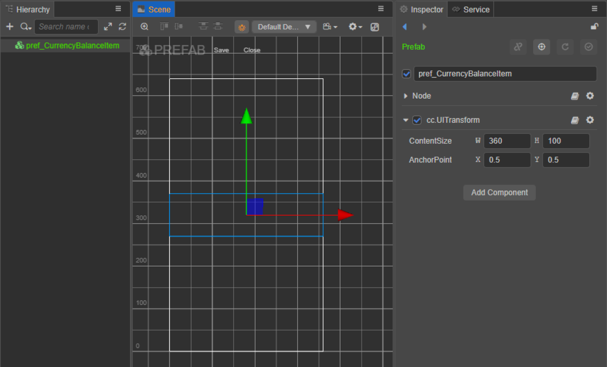
잔액 표시용 위젯 생성
- 프리패브를 생성합니다. 이렇게 하려면 폴더의 컨텍스트 메뉴에서
Create > Node Prefab 를 선택합니다. - 생성된 프리패브를 엽니다.
- 아래 이미지와 같이 프리패브의 루트에
UITransform구성 요소를 추가하고 콘텐츠 크기를 설정합니다.
- 다음 UI 요소를 프리패브 하위 개체로 추가하고 해당하는 비주얼을 구성합니다.
- 위젯 배경 이미지
- 인게임 재화 이름
- 인게임 재화 수량
- 인게임 재화 이미지
위젯 구조 예시:
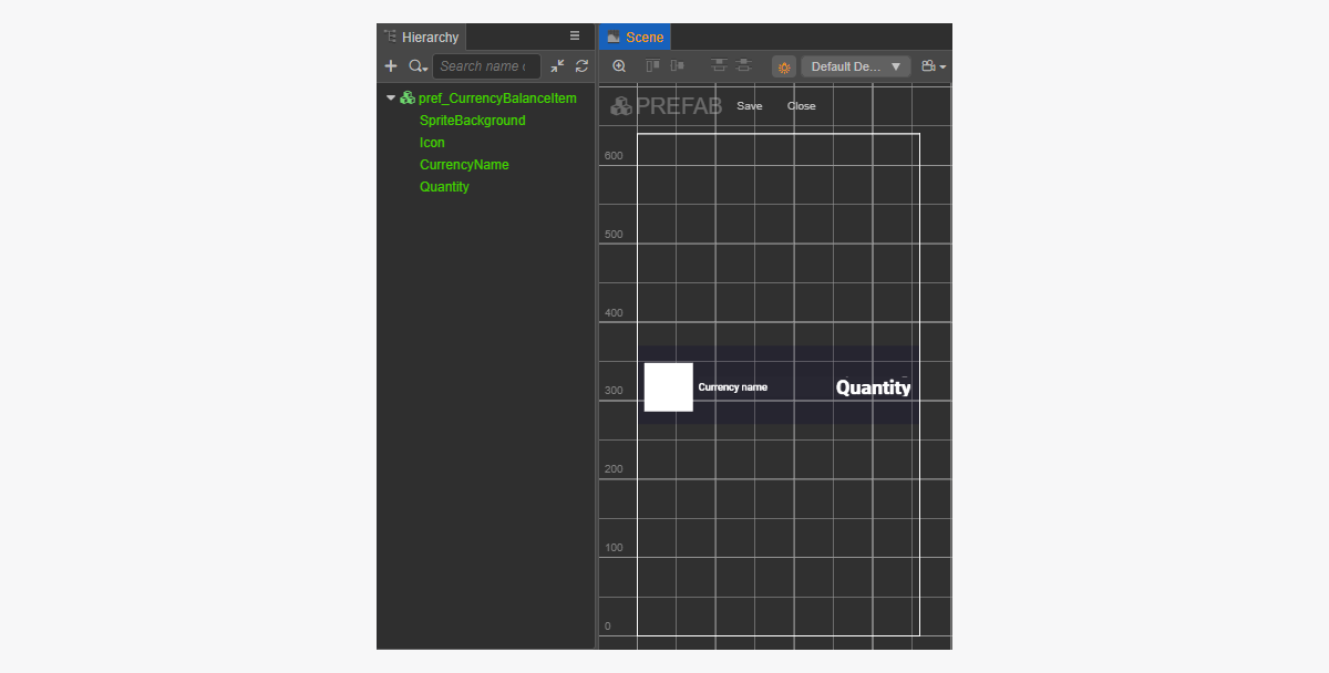
잔액 표시 위젯 스크립트 생성
- CurrencyBalanceItemComponent 생성을 수행한 후 다음 속성을 추가합니다.
iconSpritecurrencyNameLabelquantityLabel
- 스크립트 예시와 같이
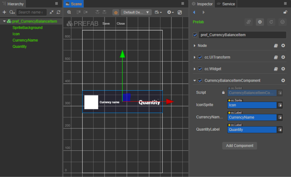
init메서드와 초기화 로직을CurrencyBalanceItemComponent클래스에 추가합니다. - CurrencyBalanceItemComponent를 프리패브의 루트 노드에 연결합니다.
- 그림과 같이 프리패브 요소를
CurrencyBalanceItemComponent의 속성에 바인딩합니다.
위젯 스크립트 예시(CurrencyBalanceItemComponent):
- typescript
 1import { _decorator, assetManager, Component, ImageAsset, Label, Sprite, SpriteFrame, Texture2D } from 'cc';
 2import { VirtualCurrencyBalance } from 'db://xsolla-commerce-sdk/scripts/api/XsollaInventory';
 3const { ccclass, property } = _decorator;
 4
 5
 6@ccclass('CurrencyBalanceItemComponent')
 7export class CurrencyBalanceItemComponent extends Component {
 8
 9    @property(Sprite)
10    iconSprite: Sprite;
11
12    @property(Label)
13    currencyNameLabel: Label;
14
15    @property(Label)
16    quantityLabel: Label;
17
18    init(data: VirtualCurrencyBalance) {
19
20        this.currencyNameLabel.string = data.name;
21        this.quantityLabel.string = data.amount.toString();
22
23        assetManager.loadRemote<ImageAsset>(data.image_url, (err, imageAsset) => {
24            if(err == null) {
25            const spriteFrame = new SpriteFrame();
26            const texture = new Texture2D();
27            texture.image = imageAsset;
28            spriteFrame.texture = texture;
29            this.iconSprite.spriteFrame = spriteFrame;
30            } else {
31                console.log(`Can’t load image with URL ${data.image_url}`);
32            }
33        });
34    }
35}
페이지 컨트롤러 생성
인게임 재화 잔액 페이지에 대한 장면을 생성하고 ScrollView 요소를 추가합니다.
페이지 구조 예시:
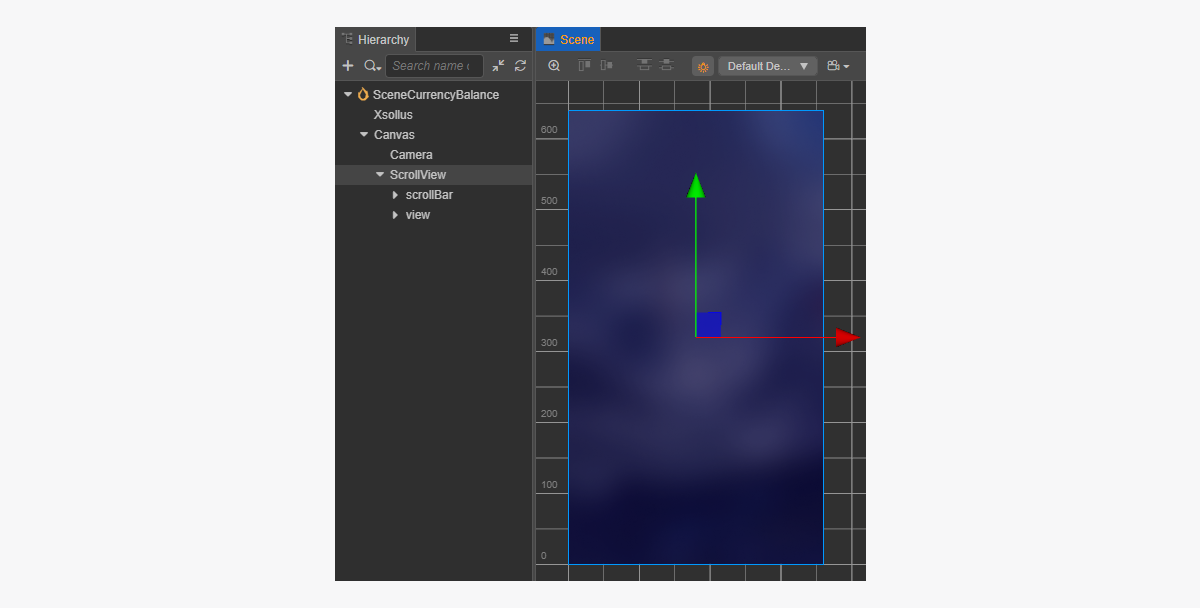
생성된 CurrencyBalanceItem 프리패브와 일치하는 ScrollView를 만들기 위해 크기를 설정하는 방법:
ScrollView노드와 내부view노드에서ContentSize매개 변수 값을 변경합니다.Layout구성 요소를content노드에 바인딩하고 이를 설정합니다. 예시에서는 다음과 같은 설정이 선택되어 있습니다.Type == verticalResizeMode == Container
인게임 재화 잔액 스크립트 구성 요소 생성
- CurrencyBalanceComponent 생성 작업을 수행한 후 다음 속성을 추가합니다.
itemsScrollViewcurrencyBalanceItemPrefab
- 스크립트 예시와 같이
start 수명 주기 함수와 초기화 로직을CurrencyBalanceComponent클래스에 추가합니다. - 장면의 노드에
CurrencyBalanceComponent 를 추가합니다. 새 노드를 추가하거나 SDK 초기화를 수행하는 동안 추가한XsollaSettingsManager구성 요소가 있는 기존 노드를 사용할 수 있습니다. - 그림과 같이 프리패브 요소를
CurrencyBalanceItemComponent의 속성에 바인딩합니다.
xsolla, 암호: xsolla). 이 데모 계정은 데모 프로젝트에만 사용할 수 있습니다.- typescript
 1import { _decorator, Component, instantiate, Prefab, ScrollView } from 'cc';
 2import { XsollaAuth } from 'db://xsolla-commerce-sdk/scripts/api/XsollaAuth';
 3import { XsollaInventory } from 'db://xsolla-commerce-sdk/scripts/api/XsollaInventory';
 4import { CurrencyBalanceItemComponent } from './CurrencyBalanceItemComponent';
 5const { ccclass, property } = _decorator;
 6
 7
 8@ccclass('CurrencyBalanceComponent')
 9export class CurrencyBalanceComponent extends Component {
10
11    @property(ScrollView)
12    itemsList: ScrollView;
13
14    @property(Prefab)
15    currencyBalanceItemPrefab: Prefab;
16
17    start() {
18        XsollaAuth.authByUsernameAndPassword('xsolla', 'xsolla', false, token => {
19            XsollaInventory.getVirtualCurrencyBalance(token.access_token, null, itemsData => {
20                for (let i = 0; i < itemsData.items.length; ++i) {
21                        let currencyBalanceItem = instantiate(this.currencyBalanceItemPrefab);
22                        this.itemsList.content.addChild(currencyBalanceItem);
23                             currencyBalanceItem.getComponent(CurrencyBalanceItemComponent).init(itemsData.items[i]);
24                    }
25                });
26        });
27
28    }
29}
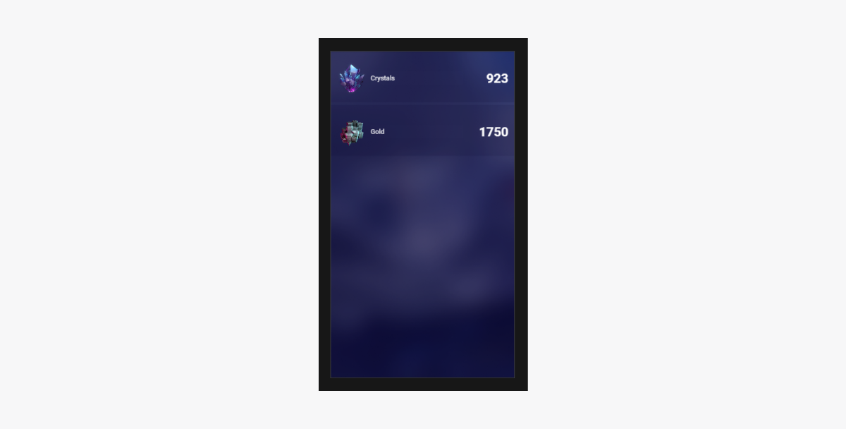
스크립트 작업 결과 예시:
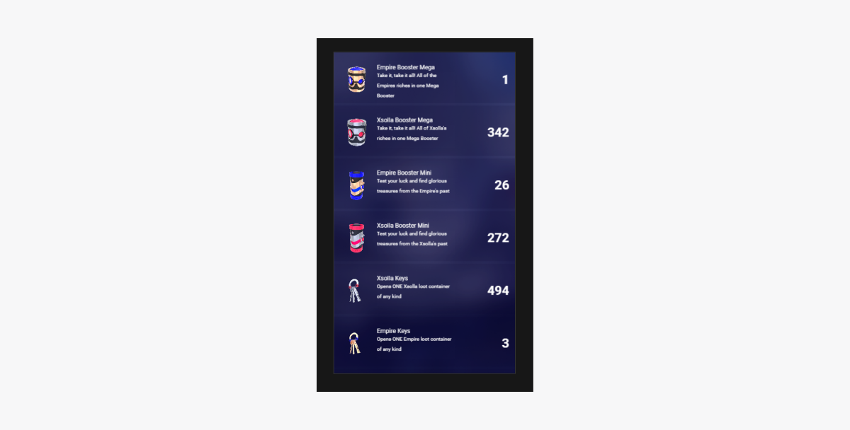
인벤토리 아이템 표시
튜도리얼은 SDK 메서드를 사용하여 사용자 인벤토리에 아이템을 표시하는 방법을 보여줍니다.
아이템 위젯 생성
- 프리패브를 생성합니다. 이렇게 하려면 폴더의 컨텍스트 메뉴에서
Create > Node Prefab 를 선택합니다. - 생성된 프리패브를 엽니다.
- 아래 이미지와 같이 프리패브의 루트에
UITransform구성 요소를 추가하고 콘텐츠 크기를 설정합니다.
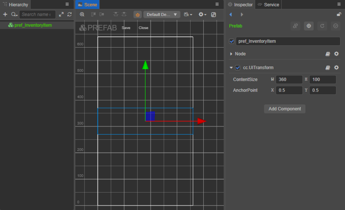
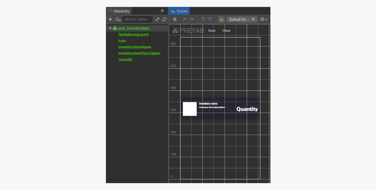
- 다음 UI 요소를 프리패브 하위 개체로 추가하고 해당하는 비주얼을 구성합니다.
- 위젯 배경 이미지
- 인벤토리 아이템 이름
- 인벤토리 아이템 설명
- 아이템 수량
- 아이템 이미지
위젯 구조 예시:
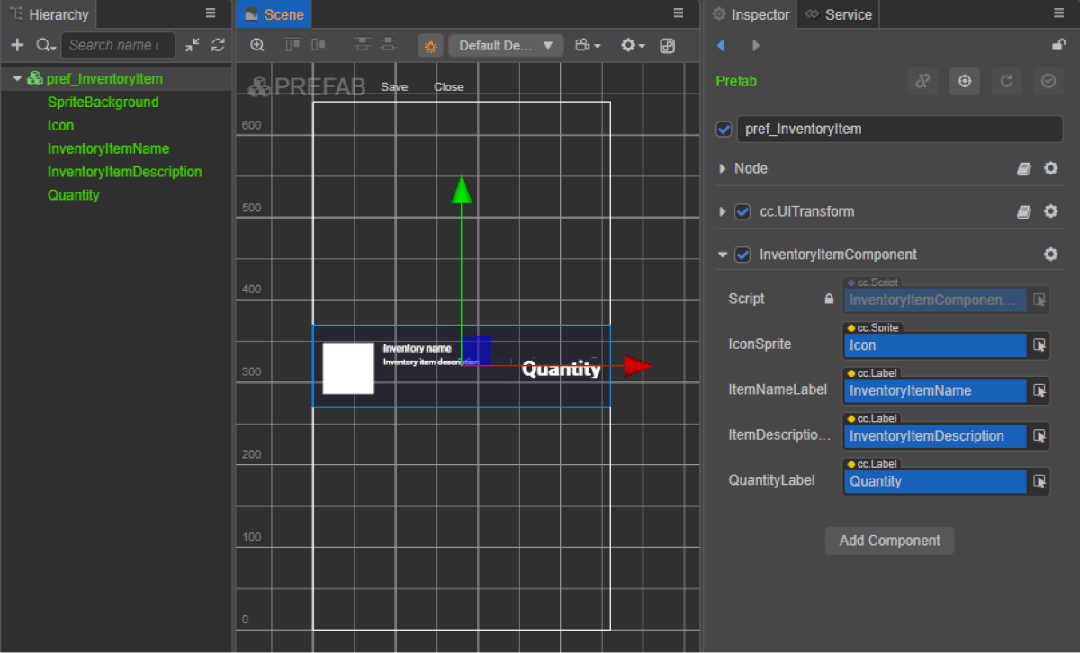
아이템 위젯 스크립트 생성
- 인벤토리ItemComponent 생성을 수행한 후 다음 속성을 추가합니다.
iconSpriteitemNameLabelitemDescriptionLabelquantityLabel
- 스크립트 예시와 같이
init메서드와 초기화 로직을InventoryItemComponent클래스에 추가합니다. - 인벤토리ItemComponent를 프리패브의 루트 노드에 연결합니다.
- 그림과 같이 프리패브 요소를
InventoryItemComponent의 속성에 바인딩합니다.
위젯 스크립트 예시(인벤토리ItemComponent):
- typescript
 1import { _decorator, assetManager, Component, ImageAsset, Label, Sprite, SpriteFrame, Texture2D } from 'cc';
 2import { InventoryItem } from 'db://xsolla-commerce-sdk/scripts/api/XsollaInventory';
 3const { ccclass, property } = _decorator;
 4
 5@ccclass('InventoryItemComponent')
 6export class InventoryItemComponent extends Component {
 7
 8    @property(Sprite)
 9    iconSprite: Sprite;
10
11    @property(Label)
12    itemNameLabel: Label;
13
14    @property(Label)
15    itemDescriptionLabel: Label;
16
17    @property(Label)
18    quantityLabel: Label;
19
20    init(data: InventoryItem) {
21
22        this.itemNameLabel.string = data.name;
23        this.itemDescriptionLabel.string = data.description;
24        this.quantityLabel.string = data.quantity.toString();
25
26        assetManager.loadRemote<ImageAsset>(data.image_url, (err, imageAsset) => {
27            if(err == null) {
28            const spriteFrame = new SpriteFrame();
29            const texture = new Texture2D();
30            texture.image = imageAsset;
31            spriteFrame.texture = texture;
32            this.iconSprite.spriteFrame = spriteFrame;
33            } else {
34                console.log(`Can’t load image with URL ${data.image_url}`);
35            }
36        });
37    }
38}
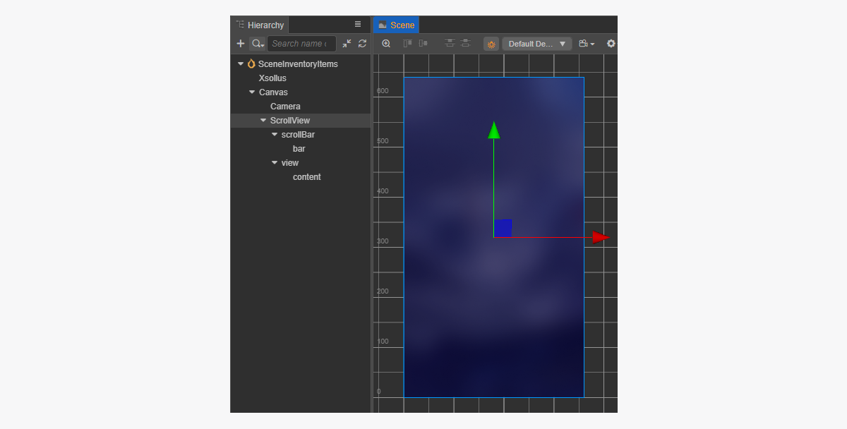
페이지 컨트롤러 생성
인벤토리 페이지에 대한 장면을 생성하고 ScrollView 요소를 추가합니다.
페이지 구조 예시:
생성된 InventoryItem 프리패브와 일치하는 ScrollView를 만들기 위해 크기를 설정하는 방법:
ScrollView노드와 내부view노드에서ContentSize매개 변수 값을 변경합니다.Layout구성 요소를content노드에 바인딩하고 이를 설정합니다. 예시에서는 다음과 같은 설정이 선택되어 있습니다.Type == verticalResizeMode == Container
인벤토리 페이지 스크립트 구성 요소 생성
- 인벤토리ItemsComponent 생성 작업을 수행한 후 다음 속성을 추가합니다.
itemsScrollViewInventoryItemPrefab
- 스크립트 예시와 같이
start 수명 주기 함수와 초기화 로직을InventoryItemsComponent에 추가합니다. - 장면의 노드에 인벤토리ItemsComponent를 추가합니다. 새 노드를 추가하거나 SDK 초기화를 수행하는 동안 추가한
XsollaSettingsManager구성 요소가 있는 기존 노드를 사용할 수 있습니다. - 그림과 같이 프리패브 요소를
InventoryItemsComponent의 속성에 바인딩합니다.
xsolla, 암호: xsolla). 이 데모 계정은 데모 프로젝트에만 사용할 수 있습니다.- typescript
 1import { _decorator, Component, instantiate, Prefab, ScrollView } from 'cc';
 2import { XsollaAuth } from 'db://xsolla-commerce-sdk/scripts/api/XsollaAuth';
 3import { XsollaInventory } from 'db://xsolla-commerce-sdk/scripts/api/XsollaInventory';
 4import { InventoryItemComponent } from './InventoryItemComponent';
 5const { ccclass, property } = _decorator;
 6
 7
 8@ccclass('InventoryItemsComponent')
 9export class InventoryItemsComponent extends Component {
10
11    @property(ScrollView)
12    itemsScrollView: ScrollView;
13
14    @property(Prefab)
15    inventoryItemPrefab: Prefab;
16
17    start() {
18        XsollaAuth.authByUsernameAndPassword('xsolla', 'xsolla', false, token => {
19            XsollaInventory.getInventory(token.access_token, null, itemsData => {
20                for (let i = 0; i < itemsData.items.length; ++i) {
21                        let inventoryItem = instantiate(this.inventoryItemPrefab);
22                        this.itemsScrollView.content.addChild(inventoryItem);
23                        inventoryItem.getComponent(InventoryItemComponent).init(itemsData.items[i]);
24                    }
25                });
26        });
27
28    }
29}
스크립트 작업 결과 예시:
오자 또는 기타 텍스트 오류를 찾으셨나요? 텍스트를 선택하고 컨트롤+엔터를 누르세요.
