How to use SDK to configure application UI
The demo project includes a UI builder. The UI builder allows you to configure the appearance of the application UI.
You can change the UI by editing the visual properties of the UI elements — colors, sprites, and fonts. These properties group into one theme. Unity themes and visual components are connected by the decorators. When you change the visual property, the decorators change the visuals of the Unity components.
Use widgets to replace the UI elements with other elements of the same type. These widgets are independent and easily replaceable parts that are in the form of prefabs.
The UI is made of 2 independent parts:
- Theme editor that is responsible for working with visuals.
- Widget editor that is responsible for working with prefabs and lets you fully replace the UI elements.
Work with themes
Theme editor
To open a theme editor, go to the Unity editor main menu and open
The theme editor UI includes the following components:
- Buttons with theme names used for selecting and applying the themes.
SetCurrentThemeByName static method of the ThemesLibrary class. Pass a theme name to this method as a parameter.Refresh button — lets you apply the theme properties or their changes to the application UI.Auto Refresh box — lets you automatically apply the theme properties or their changes to the application UI.Themes section — contains the list of existing themes.Colors section — contains the list of theme colors.Sprites section — contains the list of theme sprites.Fonts section — contains the list of theme fonts.
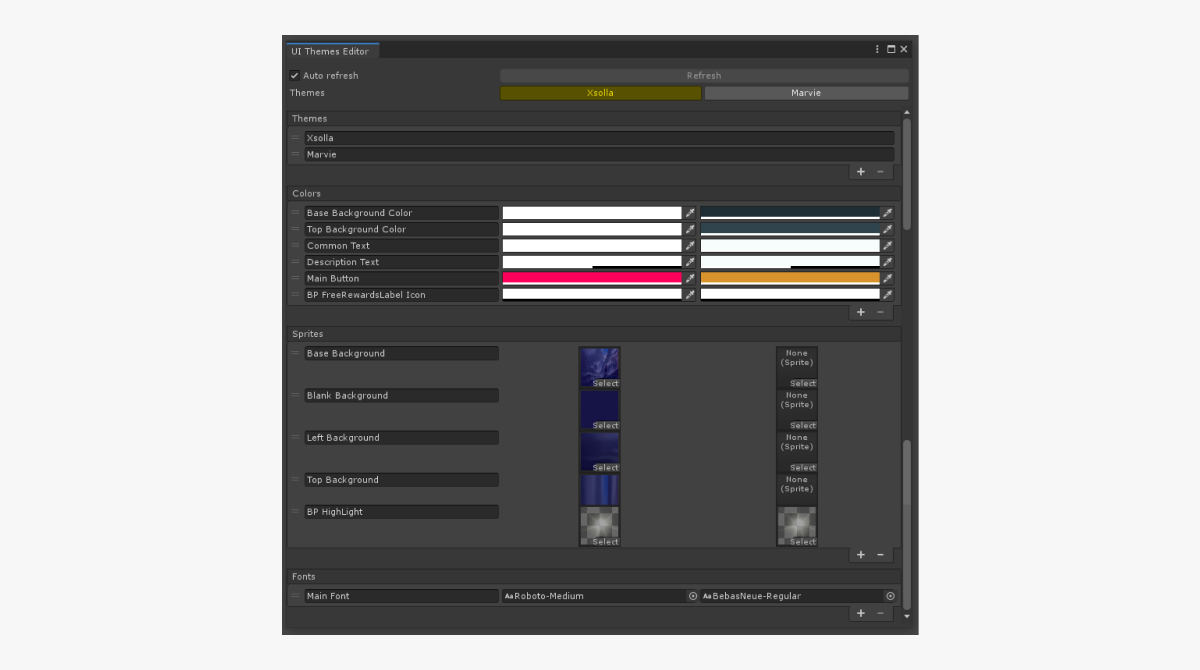
You can do the following actions to the lists:
- To add a new element, click the + icon in the lower part of the list.
- To delete the selected element, click the - icon in the lower part of the list.
- To change the order, click and hold the = icon and drag the element to the necessary position in the list.
- To rename the element, change the text in the field with the element name.
The property values are changed in the standard Unity ways:
- To change the color, click the property’s field and select a new value.
- You can change the font or sprite in one of the following ways:
- Drag an asset to the property field.
- Click the ⊙ icon and select an asset.
Theme library
The theme library is inherited from the ScriptableObject class and is situated in the Resources/UIBuilder/ThemesLibrary directory.
Connect UI element to theme
To make the UI element visuals change according to the applied theme:
- Add decorators to the object and configure them.
- Add the property provider components to the object and configure them.
Decorators
Decorators are components that apply theme properties (color, sprite, or font) to standard Unity UI elements and change them.
Decorators contain property IDs, not the values of properties, and a link to the UI element (image or text). Generally, decorators are like connectors between themes and UI elements. You configure decorators in the
List of decorators:
ImageColorDecorator— changes image colorImageSpriteDecorator— changes image spriteTextFontDecorator— changes text colorTextColorDecorator— changes text font
A decorator changes the element properties if the following events happen:
- Object is activated in the theme editor or during a game runtime.
- Current theme is changed in the editor or during the game runtime.
- Connection between an object property and theme is changed in the
Inspector panel. - Property value is changed in the theme editor.
- Object prefab is opened for editing in the theme editor.
To add a connection between the UI element and a theme, do the following:
- Add a decorator component to the object.
- Select the ID of the property from the theme.
After the decorator is added to the object, it tries to find a required UI element on this object and assign it to the Comp variable.
Example of decorator application:
The ImageColorDecorator decorator is added to the image object. The Main Button ID for the color is specified in the example. As a result, the color specified in the theme for Main Button will be used for the image.
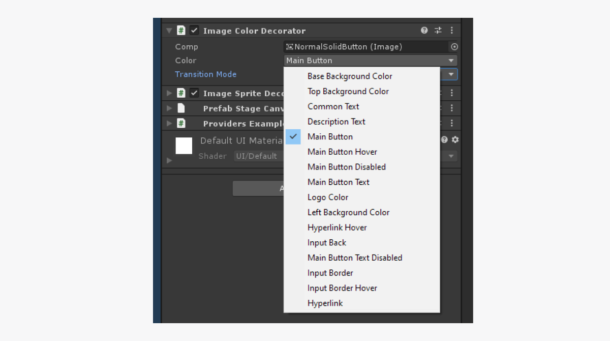
The decorator can dynamically change the component’s visuals while the game is being played and the user points at the object with a cursor or clicks the object.
To dynamically change visuals of the UI element:
- Add a decorator component to the object.
- Select the ID of the property from the theme.
- Add the
DecoratorPointerEventscomponent to the object. This component tracks the events of clicking the object and pointing a cursor at it. - In the decorator component, change the
TransitionModevariable value toOverride. - Assign the added
DecoratorPointerEventscomponent to thePointerEventsvariable of the decorator. - To change the visuals when pointing with a cursor:
- Check the
Override on hover box. - In the field near the box, select the ID of a property from the theme.
- Check the
- To change the visuals when clicking:
- Check the
Override on press box. - In the field near the box, select the ID of a property from the theme.
- Check the
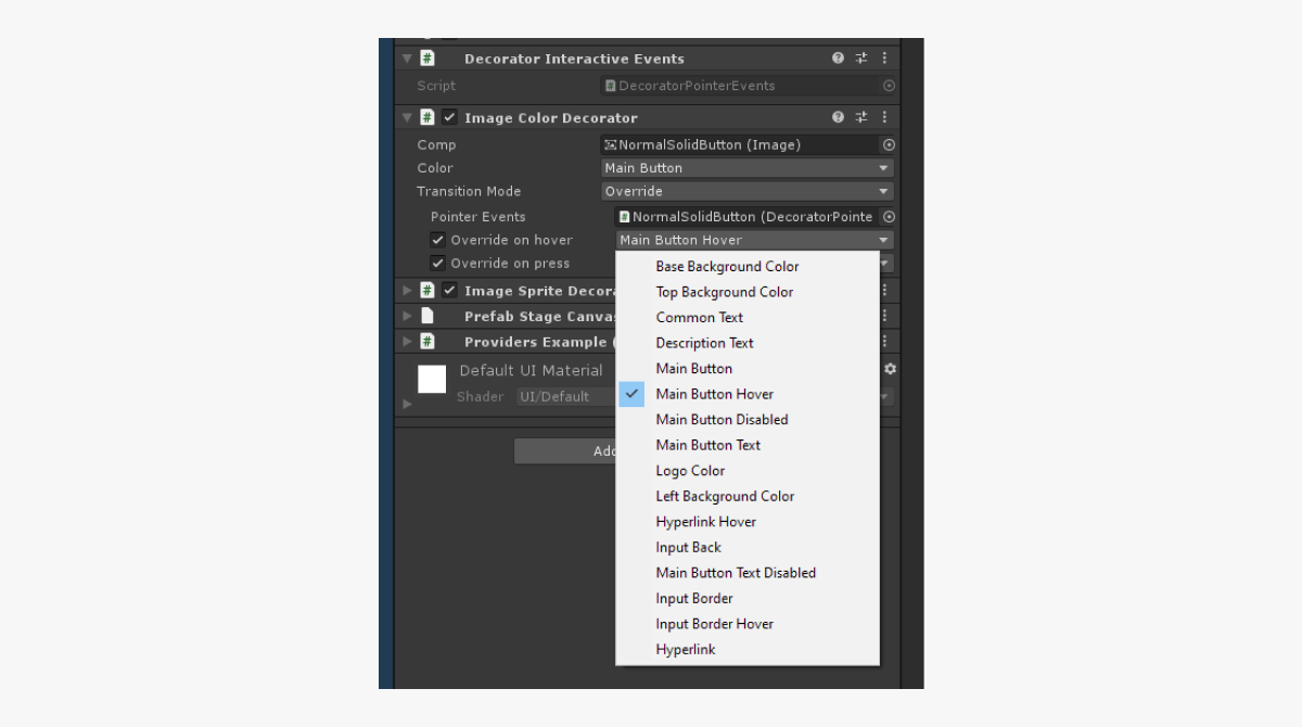
Example of decorator’s application for dynamic change of visuals:
The ImageColorDecorator decorator is added to the image object. The Main Button ID for the color and the Main Button Hover ID for the color when pointing a cursor is specified in the example. As a result, the color specified in the theme for Main Button will be used for the image. When pointing a cursor, the color will change to the one specified in the theme for Main Button Hover.
Property providers
Property providers are classes in the form of containers for theme properties. They are used for more convenient connections between the user code and themes.
List of property providers:
ColorProvider— contains a link to the color property.SpriteProvider— contains a link to the sprite property.FontProvider— contains a link to the font property.
All property providers have a PropertyDrawer for more convenient configuration via the
To configure a property provider and get the property value in a code:
- Add a property provider component to the object.
- Select an ID of a property from the theme.
Example of property providers configuration:
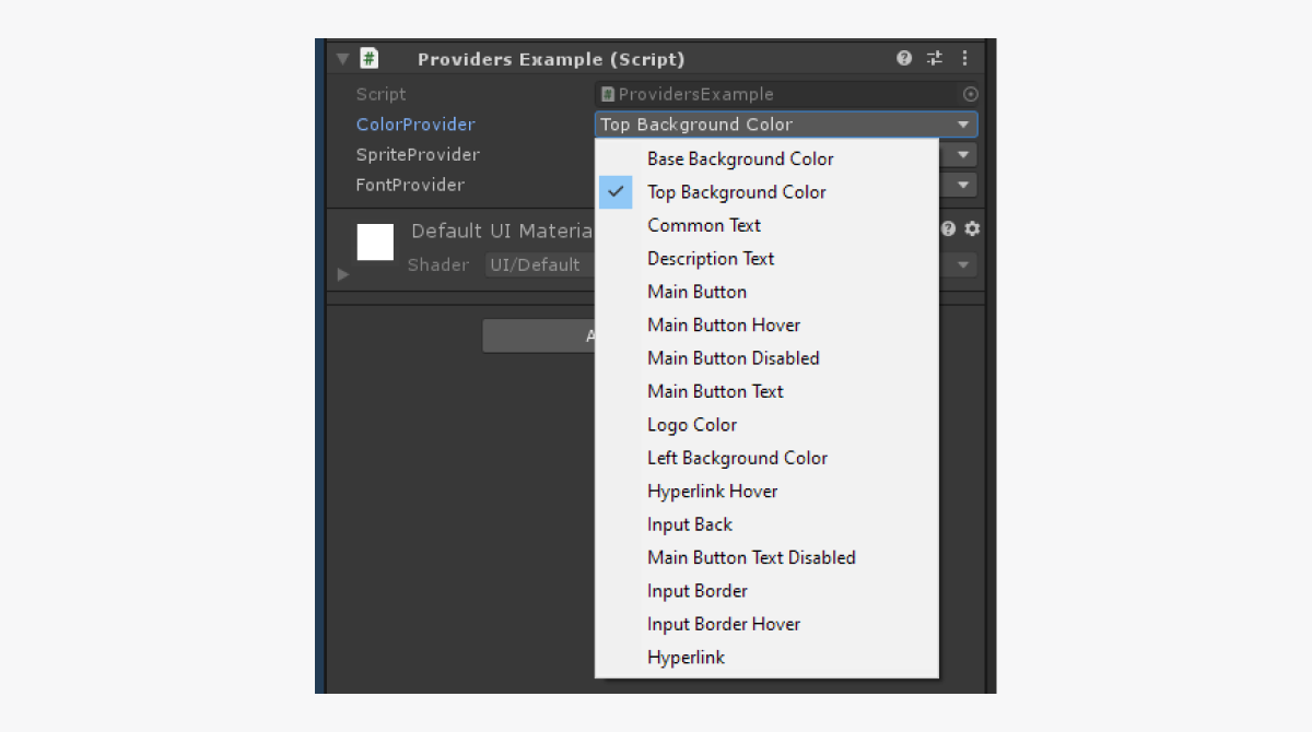
- In the script, declare a variable and assign a property provider component to it.
- To get a color value, call the
GetValuemethod.
Example of the script:
- C#
 1public class ProviderExample : MonoBehaviour
 2{
 3
 4  [SerializeField] private ColorPrivider ColorPrivider;
 5
 6  private void Start()
 7  {
 8      Color color = ColorProvuder.GetValue();
 9  }
10
11}
Work with widgets
Widget editor
To open a widget editor, go to the Unity editor main menu and open
The widget editor UI includes the following components:
Refresh button — lets you apply widget changes in prefabs.Auto Refresh box — lets you automatically apply widget changes in prefabs.Widgets section — contains the list of widgets.
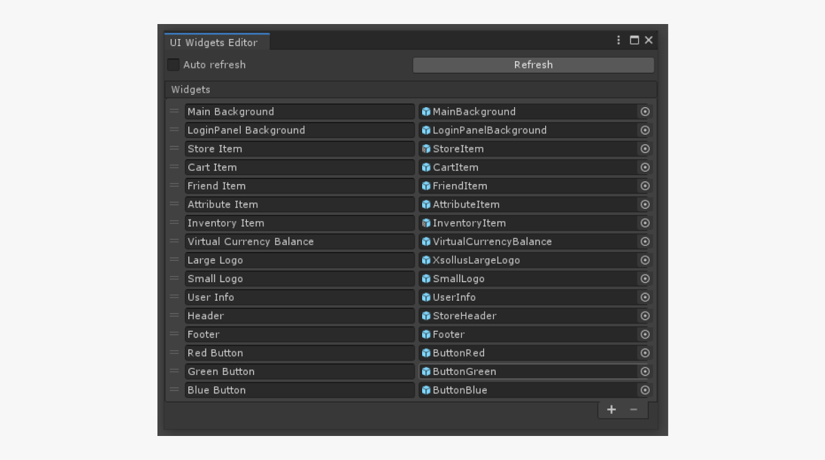
You can do the following actions to the list of widgets:
- To add a new widget, click the + icon in the lower part of the list.
- To delete the selected widget, click the - icon in the lower part of the list.
- To change the order, click and hold the = icon and drag the element to the necessary position in the list.
- To rename the widget, change the text in the field with the element name.
- You can change the font or sprite in one of the following ways:
- Drag a prefab to the field with a widget.
- Click the ⊙ icon and select a prefab.
Widget library
The widget library is inherited from the ScriptableObject class and is situated in the Resources/UIBuilder/WidgetsLibrary directory.
Connect UI element to widget
To easily replace UI elements with others, you should use widget containers instead of using widgets directly when building the UI. If you do so, you can simply configure the widget created by a container to change UI elements of the same type. The standard approach would require replacing all widgets manually.
The container creates a widget object as a child object and configures the RectTransform class properties for it, making the widget fill the whole space in the container.
When adding a container component to the UI element object, this object is used as a parent object for creating widgets.
The container changes the widget properties if the following events happen:
- Connection between an object property and widget is changed in the
Inspector panel. - Widget prefab is changed in the widget editor.
To connect the UI element and widget:
- Add the
WidgetContainercomponent to the object. - Select a widget ID.
If an object with a widget container is a prefab, you can change the container settings only in the prefab editing mode. This is because you can change the hierarchy of child objects inside a Unity prefab only in this mode.
When replacing the widget, the current widget is deleted and the new widget is created. Keep this in mind when designing the working logic of objects and their connections.
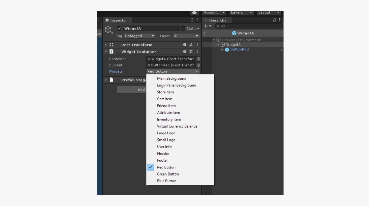
Example of using a widget container:
For the WidgetA object, the widget with the Red Button ID is specified in the example. As a result, the WidgetA object will be created using a prefab specified for the Red Button widget in the editor.
UI builder structure
While operating, the UI builder uses the following components:
UIProperty— objects with the following data:- ID of the property
- Property name
- Visual data (colors, sprites, fonts, etc.)
Theme— theme component. The theme lets you change the visuals of the UI and represents a collection of properties in different groups (colors, sprites, and fonts). Every theme has a name and unique identifier. You can access the theme property using the ID of the property.ThemesLibrary— library of all themes that exist in the project. It also contains the value of a current theme and provides methods for changing this value.ThemeDecorator— the MonoBehaviour class components that refer to the theme properties and apply the values of these properties to standard Unity UI components. TheImageColorDecoratordecorator, for example, changes the image color.UIPropertyProvider— classes that give access to themes’ properties. Use these components to easily connect the user code with the data from themes. TheColorProviderclass, for example, provides data about the colors.WidgetContainer— theMonoBehaviourclass component that lets you change the whole widget.WidgetsLibrary— collection of widgets that exist in a project. The component contains the list of all widgets and provides methods for getting the widget by its ID.
Found a typo or other text error? Select the text and press Ctrl+Enter.
