
Additional features
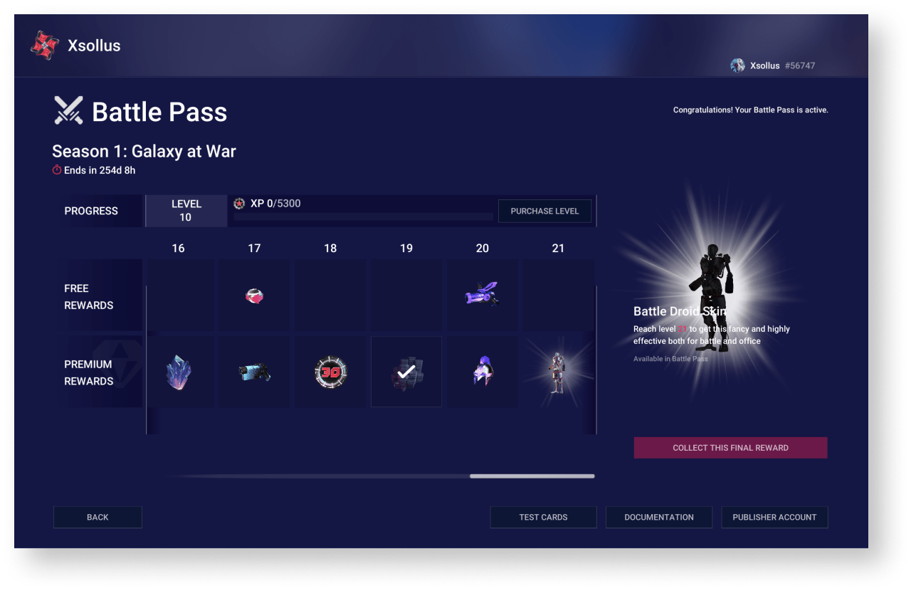
The battle pass lets you increase player engagement by issuing rewards for completing quests or playing actively during the period of the battle pass.
A free battle pass with limited rewards is available to all players. The final reward is also not included in the free pass.
Additionally, the player can purchase a premium pass with all the rewards, including the final one.
Battle pass progress is divided into levels. To unlock new levels and have time to open the final reward before the battle pass expires, the player needs to gain the necessary experience or purchase the level.
The demo project provides an example of implementing a battle pass using Xsolla products. To try battle pass:
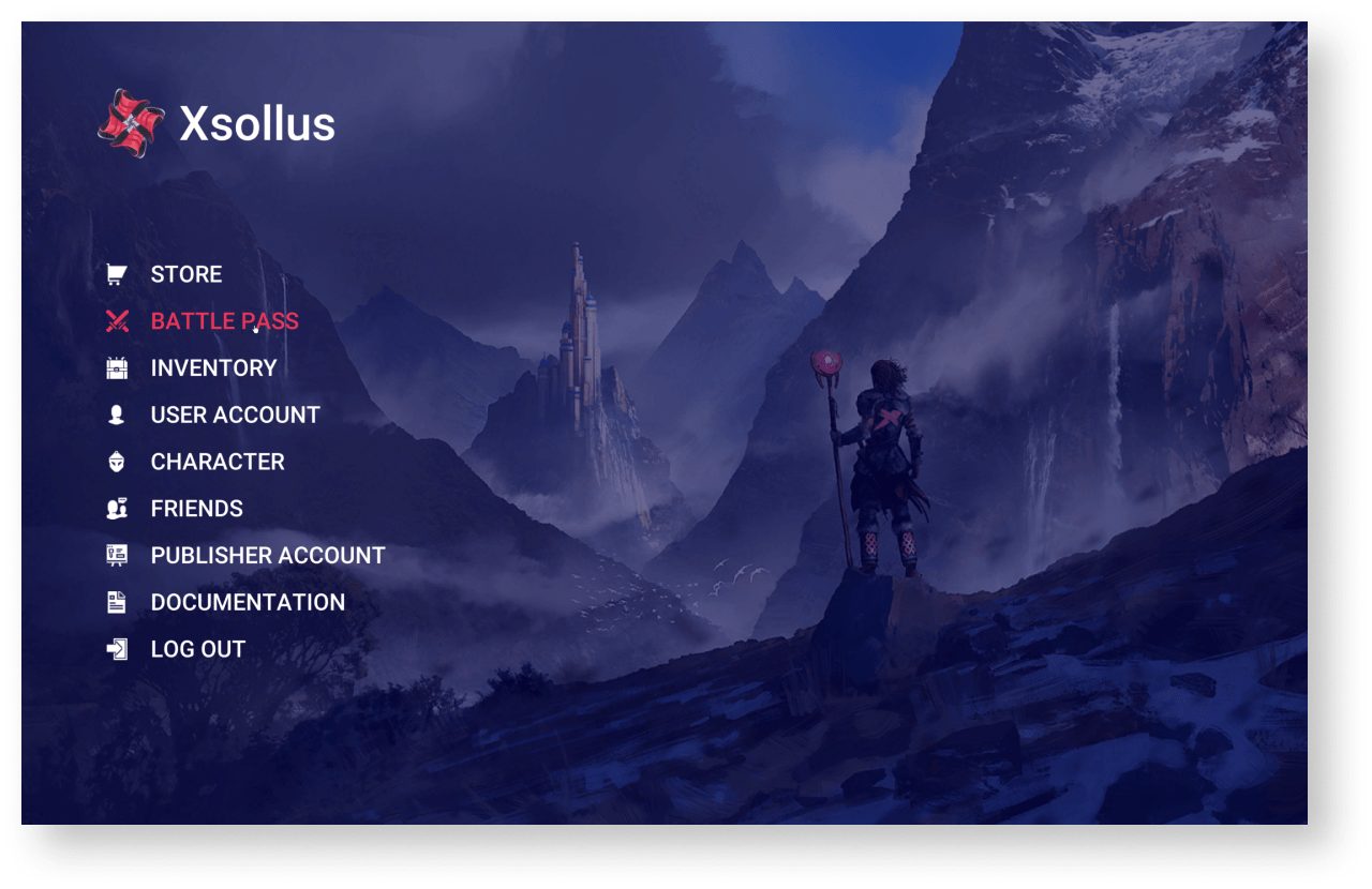
- Start the
Xsollus demo map. - Log in as a demo user or create a new user.
- Click
Battle pass in the side menu.
To adapt the battle pass for your project:
- Add battle pass logic to your project.
- Create a set of reward coupons.
- Create a battle pass configuration.
- Create a battle pass item.
- Create a level-up item.
Add battle pass logic to project
To add battle pass logic:
- Copy the
BP_BattlepassPanelandBP_StoreDemoblueprints with all dependencies into your project. - Change the interface (optional).
- Modify the storing information logic.
Create set of reward coupons
Rewards can be virtual items and virtual currency packages.
In the current solution, rewards are granted to a player via the coupon redemption. To create a coupon set:
- Go to your project in Publisher Account.
- Create virtual items and virtual currency packs for rewarding players.
- For each reward set up a campaign with coupons using the following recommendations:
- Specify the number of redemptions per user as the planned amount of coupon redemption in the battle pass. One coupon can be redeemed multiple times as a part of the battle pass (e.g., at different battle pass levels, at premium and free versions).
- The campaign must be valid for the same period as the battle pass.
To build the battle pass configuration, it is recommended that you create a list of rewards in advance and for each of them indicate:
- coupon code
- virtual item or virtual currency package SKU
- if the reward belongs to a specific level of the battle pass
- If the reward belongs to the free or premium version
Create battle pass configuration
The battle pass configuration is a JSON file containing:
- the name of the battle pass
- the expiry date of the battle pass
- the structure of the levels, indicating the rewards for the free and premium versions
JSON file structure:
| Parameter | Type | Description |
|---|---|---|
Name | string | The name of the battle pass. Must match the name of the battle pass item. |
ExpiryDate | string | The expiration date of the battle pass. |
Levels | array | Battle pass level structure. |
Levels.Tier | integer | Level number. |
Levels.Experience | integer | The amount of experience to reach the next level. |
Levels.FreeItem | object | Reward information for the free version of the battle pass. Can be null. |
Levels.FreeItem.Sku | string | The SKU of a virtual item or virtual currency package. Used to display the reward image and information about it to the user. For a virtual currency package, both the package SKU and the virtual currency SKU can be used. |
Levels.FreeItem.Quantity | integer | The number of rewards. |
Levels.FreeItem.Promocode | string | The coupon code for the reward. |
Levels.PremiumItem | object | Reward information for the premium version of the battle pass. Can be null. |
Levels.PremiumItem.Sku | string | The SKU of a virtual item or virtual currency package. Used to display the reward image and information about it to the user. For a virtual currency package, both the package SKU and the virtual currency SKU can be used. |
Levels.PremiumItem.Quantity | integer | The number of rewards. |
Levels.PremiumItem.Promocode | string | The coupon code for the reward. |
Battle pass configuration example:
- json
 1{
 2  "Name": "BP2021JAN",
 3  "ExpiryDate": "29-03-2021",
 4  "Levels": [
 5    {
 6      "Tier": 1,
 7      "Experience": 1000,
 8      "FreeItem": {
 9        "Sku": "Sku",
10        "Quantity": 10,
11        "Promocode": "HELLO_WORLD"
12      },
13      "PremiumItem": {
14        "Sku": "Sku2",
15        "Promocode": "HELLO_WORLD2"
16      }
17    },
18    {
19      "Tier": 2,
20      "Experience": 1000
21    },
22    {
23      "Tier": 3,
24      "Experience": 1000
25    }
26  ]
27}
Create battle pass item
The battle pass item is a container for the battle pass configuration and is used to determine the player’s premium status (whether the player has purchased a premium version).
To create a battle pass item:
- Go to your project in Publisher Account.
- Create a virtual item group named
#BATTLEPASS# .
- Create a virtual item with the following parameters:
- Item name — the name of the battle pass specified in the configuration.
- SKU — the battle pass ID. It is recommended to use the name of the battle pass specified in the configuration.
- Item property — consumable or nonconsumable item.
- Price — the price of the premium version of the battle pass. It is set in virtual or real currency.
- Group —
#BATTLEPASS# .
- Group —
- Add the battle pass configuration to the created virtual item:
- Get the current description of the item in a JSON format using the
Get virtual item API call. - Convert the battle pass configuration to a string using an online service or the
JSON.stringify() method in JavaScript. - In the item description, specify the resulting string in the
enobject of thelong_descriptionparameter. - Modify the item using the
Update virtual item API call, specifying the updated item description in the request body.
- Get the current description of the item in a JSON format using the
Example of the battle pass item description:
- json
 1{
 2  "sku": "BP2021JAN",
 3  "name":{
 4    "en": "BP2021JAN"
 5  },
 6  "type": "virtual_good",
 7  "description":{
 8    "en": "BP2021JAN"
 9  },
10  "image_url": "https://cdn3.xsolla.com/img/misc/images/7cb1c2b719af329a9bc1df994d58b749.png",
11  "long_description": {
12    "en": "{
13                \"Name\":\"BP2021JAN\",
14                \"ExpiryDate\":\"01-07-2021\",
15                \"Levels\":
16                    [
17                        {
18                            \"Tier\":1,
19                            \"Experience\":100,
20                            \"FreeItem\":
21                                {
22                                    \"Sku\":\"Bullets\",
23                                    \"Promocode\":\"B2021S1FL1E100\",
24                                    \"Quantity\":50
25                                }
26                        }
27                    ]
28            }"
29  },
30  "attributes":[
31  ],
32  "is_free": false,
33  "order": 1,
34  "groups":[
35    "Battlepass"
36  ],
37  "regional_prices":[
38  ],
39  "prices":[
40    {
41      "amount": 1,
42      "currency": "USD",
43      "is_default": true,
44      "is_enabled": true
45    }
46  ],
47  "media_list":[
48  ],
49  "vc_prices":[
50  ],
51  "is_enabled": true,
52  "is_show_in_store": true,
53  "regions":[
54  ],
55  "inventory_options":{
56    "consumable": false,
57    "expiration_period": null
58  }
59}
Create level-up item
The current battle pass solution lets players purchase levels for real or virtual currency. The price of a level is always the same. The experience the player gains within the current level is transferred to the next level.
To create a level-up item:
- Go to your project in Publisher Account.
- Create a virtual item with the following parameters:
- Item name — the name of the level-up item in the format
<battlepassname>_levelup_util , where<battlepassname> is the name of the battle pass specified in the configuration. - SKU — it is recommended to use the name of the battle pass specified in the configuration.
- Item property — consumable or nonconsumable item.
- Price — the price of a level. It is set in virtual or real currency.
- Item name — the name of the level-up item in the format
- Group —
#BATTLEPASS# .
- Group —
Specifics of the current battle pass solution
Logic of displaying battle pass
The application displays only one battle pass according to the logic:
- If one or more unexpired battle passes exist, the application displays the battle pass with the closest expiration date.
- If all battle passes are expired, the application displays the last expired battle pass.
EXAMPLE 1
Current date: 03/04/2021.
The expiration dates of the battle passes: 03/01/2021, 04/01/2021, 05/01/2021.
The application displays a battle pass with an expiration date of 04/01/2021.
EXAMPLE 2
Current date: 03/04/2021.
Expiration dates for battle passes: 02/01/2021, 03/01/2021.
The application displays a battle pass with an expiration date of 03/01/2021.
Storing information logic
In the current solution, all information about a player’s progress on a battle pass (level, experience, received rewards, etc.) is stored in the user-editable attributes. As part of the demo, reading and editing these attributes is available on the
If the system doesn’t find the required attribute, a new one is automatically created. If the system finds attributes for the not current battle pass, those attributes are automatically deleted.
To determine the premium status of a player, the presence of the battle pass item in the player’s inventory is checked.
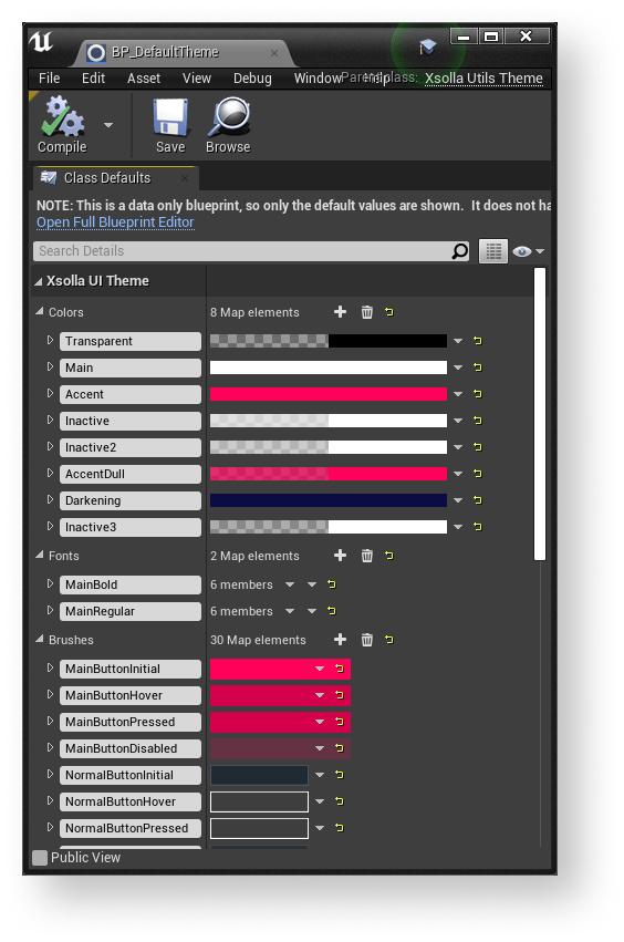
The SDK includes a UI builder. The UI builder lets you configure the visuals of the application UI.
You can change the UI by editing global settings that affect UI elements’ visuals — color, texture, and font. These properties group into a theme.
To swap the UI elements of the same type, you can use the widget wrappers — containers for created UI elements.
The UI builder contains 2 independent parts:
- Themes are responsible for working with visuals.
- Widget manager is responsible for working with widgets and lets you replace whole parts of the UI.
Work with themes
Theme is a XsollaUtilsTheme type asset. It contains the list of colors, fonts, and textures that are used by the UI elements. Every list is a set of key-value pairs where the key is a unique name of a theme parameter, and the value is a corresponding color, font, or texture.
You can work with themes in
- To set the theme of the UI, select it in the
Interface Theme field. - To edit the selected theme, click the
🔎 icon near theInterface Theme field.
- To create a new theme, click the + icon near the
Interface Theme field. - To delete a selected theme, click the × icon near the
Interface Theme field.
Connect UI element to theme
To connect the UI element to the theme:
- In the UI element widget blueprint, get access to the theme by the following methods:
GetCurrentTheme— returns the current theme specified in the plug-in settings.GetTheme— returns a theme by the name specified in theThemeClassparameter.
- Use the following methods to get the values of definite parameters from the theme by passing the theme parameter name to them:
GetColor— gets color value.GetFont— gets font.GetBrush— gets texture.
In the demo project, every widget that supports themes has a set of String type parameters with theme parameter names. These parameters are used for setting up a visual for the UI element.
To find examples of widgets that support themes, go to
Work with widget manager
The widget manager is a mechanism that lets you automatically replace the UI elements with the UI elements of the same type by changing their visuals and behavior.
To create the UI that supports the widget manager, the following conditions should be met:
- Create a widget with the specified unified interface for the UI element.
- Define the type name for the UI element widget in the widget library.
- Pass the widget type for the UI element to the wrapper. The wrapper is a container for creating the UI elements. The name of the widget type should be identical to the name in the library.
- When creating a UI, use the wrapper instead of the widget.
Widget wrappers
A wrapper is a container that creates a required widget in the area of the page that is occupied by the wrapper.
Using the widget wrappers when creating the UI lets you automatically change the UI elements within the whole UI. To do this, change the widget in the wrapper. The standard flow, that uses UI primitives, suggests replacing all widgets manually in this scenario.
Here are the following wrappers for different widget types:
W_ButtonWrapper— for a buttonW_InputWrapper— for an input fieldW_TextWrapper— for textW_RichTextWrapper— for rich textW_ImageWrapper— for an imageW_CheckBoxWrapper— for a box
In the
You can find the widget wrappers blueprints in
The wrappers use the widget manager methods to interact with the widgets.
Widget interfaces
To make the UI primitives interact with the widget wrapper as they would with the usual widget, the wrappers use unified interfaces.
There are the following wrappers for different widget types:
BPI_PrimitivesButton— for a buttonBPI_PrimitivesInput— for an input fieldBPI_PrimitivesText— for textBPI_PrimitivesRichText— for rich textBPI_PrimitivesImage— for an imageBPI_PrimitivesCheckbox— for a box
You can configure interfaces for the UI elements widgets in the
You can find the widget interfaces in
Widget library
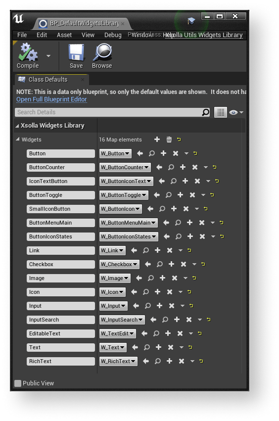
The widget library is an asset of the XsollaUtilsWidgetsLibrary type that contains the list of widget classes in a form of key-value pairs. The key contains the name of the widget type and the value contains the widget class that will be created by a corresponding wrapper with this key.
The widget library works as a connector between the wrappers and widget classes.
The BP_DefaultWidgetLibrary default widget library is included in the SDK. This library contains the list of UI elements from the demo project.
You can work with the widget library in
- To install the current widget library, select it in the
Widgets Library field. - To edit the selected widget library, click the
🔎 icon near theWidgets Library field.
- To create a new widget library, click the + icon near the
Widgets Library field. - To delete the selected widget library, click the × icon near the
Widgets Library field.
Use the following methods in the wrapper blueprints to get access to the widget library:
GetCurrentWidgetsLibrary— returns the current widget library specified in the plug-in settings.GetWidgetsLibrary— returns the specified widget library by the name specified in theWidgetLibraryClassparameter.
Use the GetWidget method in the wrapper blueprints, to get the widget type from the library.
Methods of widget manager
The following methods are used by the wrappers to interact with the widgets. Use them when creating your own wrappers and widgets that support themes.
Methods for working with buttons
| Method name | Description |
|---|---|
SetButtonEnabled | Sets the button state that defines whether the button reacts to the keyboard, mouse, timer events, etc. |
IsButtonEnabled | Returns the button state that defines whether the button reacts to the keyboard, mouse, timer events, etc. |
GetWidget | Returns the list of UI primitives that contain the widget. Is used for subscribing to the button-clicking event. |
ConstructButton | Initializes the button widget. Is used by the widget wrapper. |
SetExtraData | Sets a list of additional data for a button. Every widget processes the received data, demonstrates it, or uses it according to the inner logic. For example, you can use the set of additional data to pass the list of the drop-down menu elements to the button that has a drop-down menu. |
SetIconData | Sets a list of icons to display for a button. Use this method to specify the icon size and the distance between the icon and other button elements. |
SetButtonSelected | Sets the toggle position. For example: on or off, in cart or not in cart, etc. |
GetThemeData | Returns the set of theme parameters used by the button widget. |
SetButtonText | Sets the text for a button. |
Methods for working with boxes
| Method name | Description |
|---|---|
SetIsChecked | Sets the state of the box whether it’s checked or unchecked. |
GetIsChecked | Returns the state of the box. |
IsTickHovered | Checks whether the cursor hovers the box area. |
ConstructCheckbox | Initializes the box widget. Is used by the widget wrapper. |
GetWidget | Returns the list of UI primitives contained by the widget. Used for subscribing to the box events. |
GetThemeData | Returns the set of theme parameters used by the box widget. |
SetText | Sets the text for the box. |
GetText | Receives the text for the box. |
Methods for working with text or rich text
| Method name | Description |
|---|---|
GetText | Returns the text value. |
SetText | Sets the text value. |
GetWidget | Returns the list of UI primitives contained by the widget. Used for subscribing to the text events. |
GetThemeData | Returns the set of theme parameters used by the text widget. |
ConstructText | Initializes the text widget. Is used by the widget wrapper. |
Methods for working with images
| Method name | Description |
|---|---|
GetImage | Returns the image. |
SetImage | Sets the image. |
GetWidget | Returns the list of UI primitives contained by the widget. Used for subscribing to the image events. |
GetThemeData | Returns the set of theme parameters used by the image widget. |
ConstructImage | Initializes the image widget. Is used by the widget wrapper. |
Method for working with input fields
| Method name | Description |
|---|---|
GetText | Returns the text to the input field. |
SetText | Sets the text to the input field. |
GetWidget | Returns the list of UI primitives contained by the widget. Used for subscribing to the input field events. |
ConstructInput | Initializes the input field widget. Is used by the widget wrapper. |
GetHint | Returns the tip text for the input field. |
SetHint | Sets the tip text for the input field. |
SetupFocus | Sets the focus on the input field. |
GetThemeData | Returns the set of theme parameters used by the input field widget. |
Found a typo or other text error? Select the text and press Ctrl+Enter.
