Recursos adicionais
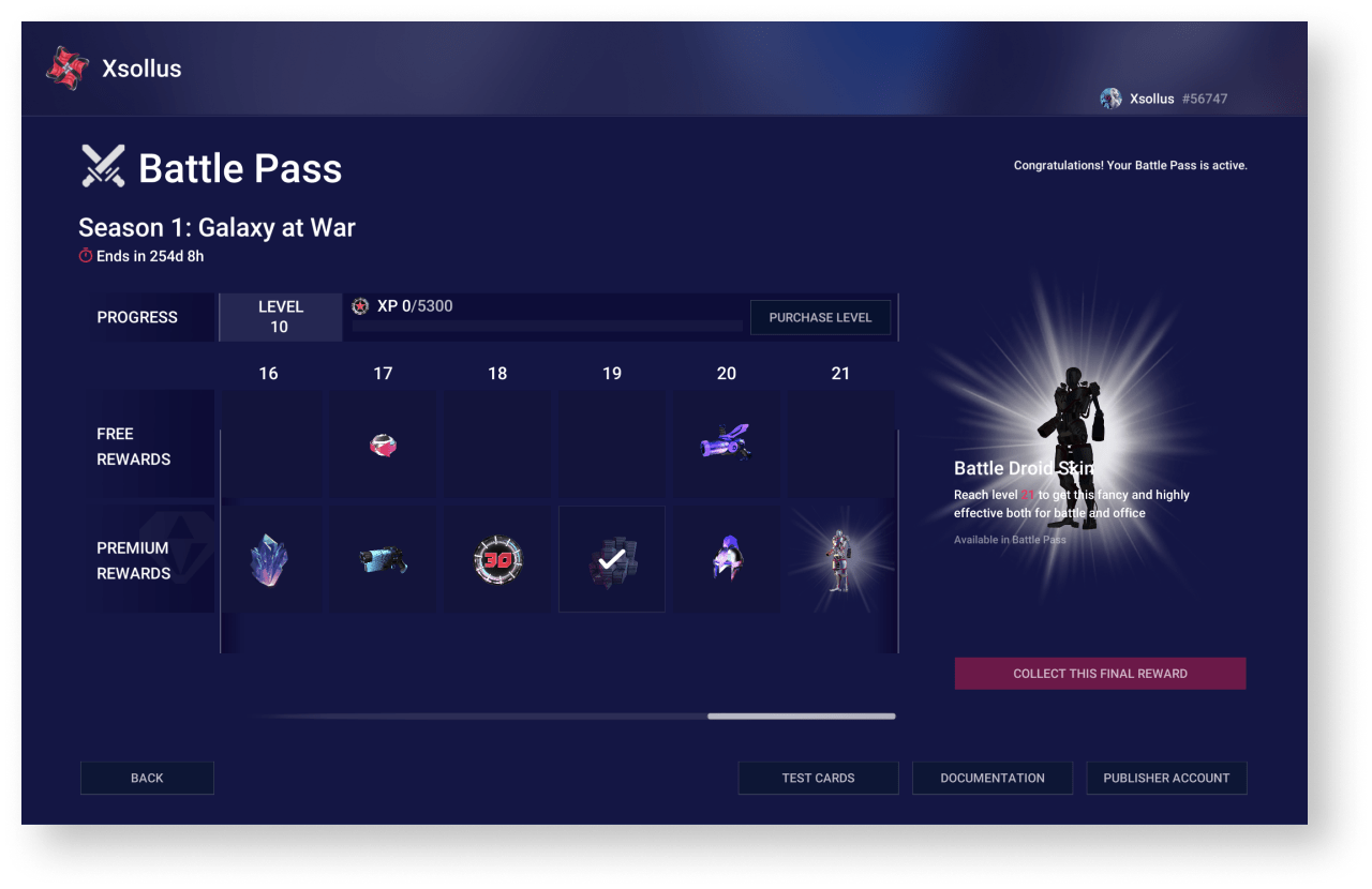
A free battle pass with limited rewards is available to all players. The final reward is also not included in the free pass.
Additionally, the player can purchase a premium pass with all the rewards, including the final one.
Battle pass progress is divided into levels. To unlock new levels and have time to open the final reward before the battle pass expires, the player needs to gain the necessary experience or purchase the level.
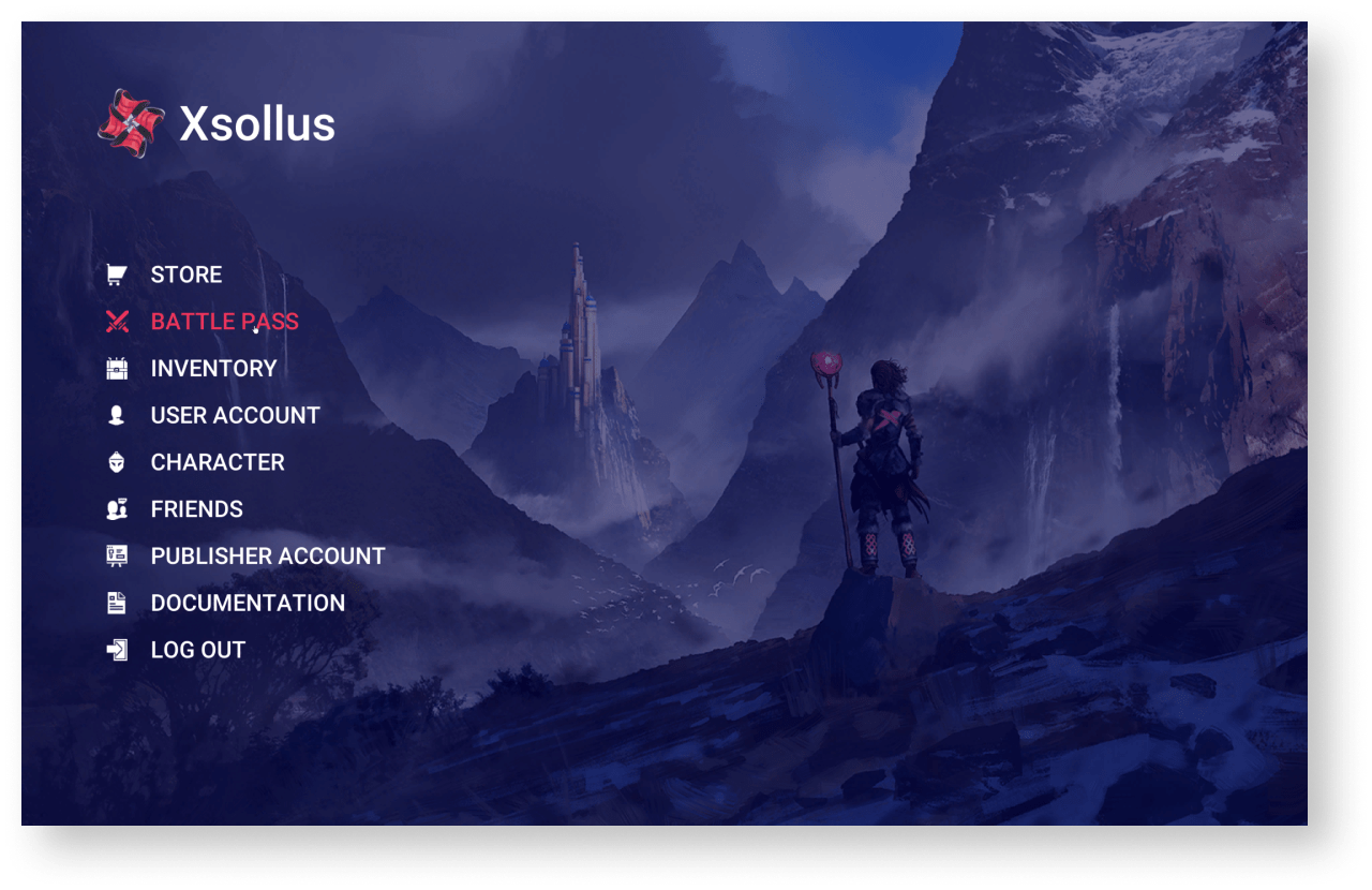
The demo project provides an example of implementing a battle pass using Xsolla products. To try battle pass:
- Start the
Xsollus demo scene. - Log in as a demo user or create a new user.
- Click
Battle pass in the side menu.
To adapt the battle pass for your project:
- Add battle pass logic to your project.
- Create a set of reward coupons.
- Create a battle pass configuration.
- Create a battle pass item.
- Create a level-up item.
Adicionar lógica de passe de batalha ao projeto
All the logic for the battle pass is contained in the BattlepassPage prefab and is divided into the following blocks:
ScriptHolders— scripts for working with the battle pass configuration, items and player informationUIScriptHolders— scripts for player’s interaction
To add battle pass logic:
- In your project, instantiate the
BattlepassPageprefab. - Change the interface (optional).
- Modify the storing information logic.
Criar um conjunto de cupons de recompensa
Rewards can be virtual items and virtual currency packages.
In the current solution, rewards are granted to a player via the coupon redemption. To create a coupon set:
- Go to your project in Publisher Account.
- Create virtual items and virtual currency packs for rewarding players.
- For each reward set up a campaign with coupons using the following recommendations:
- Specify the number of redemptions per user as the planned amount of coupon redemption in the battle pass. One coupon can be redeemed multiple times as a part of the battle pass (e.g., at different battle pass levels, at premium and free versions).
- The campaign must be valid for the same period as the battle pass.
To build the battle pass configuration, it is recommended that you create a list of rewards in advance and for each of them indicate:
- coupon code
- virtual item or virtual currency package SKU
- if the reward belongs to a specific level of the battle pass
- If the reward belongs to the free or premium version
Criar configuração de passe de batalha
The battle pass configuration is a JSON file containing:
- the name of the battle pass
- the expiry date of the battle pass
- the structure of the levels, indicating the rewards for the free and premium versions
JSON file structure:
| Parameter | Type | Description |
|---|---|---|
Name | string | The name of the battle pass. Must match the name of the battle pass item. |
ExpiryDate | string | The expiration date of the battle pass. |
Levels | array | Battle pass level structure. |
Levels.Tier | integer | Level number. |
Levels.Experience | integer | The amount of experience to reach the next level. |
Levels.FreeItem | object | Reward information for the free version of the battle pass. Can be null. |
Levels.FreeItem.Sku | string | The SKU of a virtual item or virtual currency package. Used to display the reward image and information about it to the user. For a virtual currency package, both the package SKU and the virtual currency SKU can be used. |
Levels.FreeItem.Quantity | integer | The number of rewards. |
Levels.FreeItem.Promocode | string | The coupon code for the reward. |
Levels.PremiumItem | object | Reward information for the premium version of the battle pass. Can be null. |
Levels.PremiumItem.Sku | string | The SKU of a virtual item or virtual currency package. Used to display the reward image and information about it to the user. For a virtual currency package, both the package SKU and the virtual currency SKU can be used. |
Levels.PremiumItem.Quantity | integer | The number of rewards. |
Levels.PremiumItem.Promocode | string | The coupon code for the reward. |
Battle pass configuration example:
- json
 1{
 2  "Name": "BP2021JAN",
 3  "ExpiryDate": "29-03-2021",
 4  "Levels": [
 5    {
 6      "Tier": 1,
 7      "Experience": 1000,
 8      "FreeItem": {
 9        "Sku": "Sku",
10        "Quantity": 10,
11        "Promocode": "HELLO_WORLD"
12      },
13      "PremiumItem": {
14        "Sku": "Sku2",
15        "Promocode": "HELLO_WORLD2"
16      }
17    },
18    {
19      "Tier": 2,
20      "Experience": 1000
21    },
22    {
23      "Tier": 3,
24      "Experience": 1000
25    }
26  ]
27}
Criar item de passe de batalha
The battle pass item is a container for the battle pass configuration and is used to determine the player’s premium status (whether the player has purchased a premium version).
To create a battle pass item:
- Go to your project in Publisher Account.
- Create a virtual item group named
#BATTLEPASS# .
- Create a virtual item with the following parameters:
- Item name — the name of the battle pass specified in the configuration.
- SKU — the battle pass ID. It is recommended to use the name of the battle pass specified in the configuration.
- Item property — consumable or nonconsumable item.
- Price — the price of the premium version of the battle pass. It is set in virtual or real currency.
- Group —
#BATTLEPASS# .
- Group —
- Add the battle pass configuration to the created virtual item:
- Get the current description of the item in a JSON format using the
Get virtual item API call. - Convert the battle pass configuration to a string using an online service or the
JSON.stringify() method in JavaScript. - In the item description, specify the resulting string in the
enobject of thelong_descriptionparameter. - Modify the item using the
Update virtual item API call, specifying the updated item description in the request body.
- Get the current description of the item in a JSON format using the
Example of the battle pass item description:
- json
 1{
 2  "sku": "BP2021JAN",
 3  "name":{
 4    "en": "BP2021JAN"
 5  },
 6  "type": "virtual_good",
 7  "description":{
 8    "en": "BP2021JAN"
 9  },
10  "image_url": "https://cdn3.xsolla.com/img/misc/images/7cb1c2b719af329a9bc1df994d58b749.png",
11  "long_description": {
12    "en": "{
13                \"Name\":\"BP2021JAN\",
14                \"ExpiryDate\":\"01-07-2021\",
15                \"Levels\":
16                    [
17                        {
18                            \"Tier\":1,
19                            \"Experience\":100,
20                            \"FreeItem\":
21                                {
22                                    \"Sku\":\"Bullets\",
23                                    \"Promocode\":\"B2021S1FL1E100\",
24                                    \"Quantity\":50
25                                }
26                        }
27                    ]
28            }"
29  },
30  "attributes":[
31  ],
32  "is_free": false,
33  "order": 1,
34  "groups":[
35    "Battlepass"
36  ],
37  "regional_prices":[
38  ],
39  "prices":[
40    {
41      "amount": 1,
42      "currency": "USD",
43      "is_default": true,
44      "is_enabled": true
45    }
46  ],
47  "media_list":[
48  ],
49  "vc_prices":[
50  ],
51  "is_enabled": true,
52  "is_show_in_store": true,
53  "regions":[
54  ],
55  "inventory_options":{
56    "consumable": false,
57    "expiration_period": null
58  }
59}
Criar item de aumento de nível
The current battle pass solution lets players purchase levels for real or virtual currency. The price of a level is always the same. The experience the player gains within the current level is transferred to the next level.
To create a level-up item:
- Go to your project in Publisher Account.
- Create a virtual item with the following parameters:
- Item name — the name of the level-up item in the format
<battlepassname>_levelup_util , where<battlepassname> is the name of the battle pass specified in the configuration. - SKU — it is recommended to use the name of the battle pass specified in the configuration.
- Item property — consumable or nonconsumable item.
- Price — the price of a level. It is set in virtual or real currency.
- Item name — the name of the level-up item in the format
- Group —
#BATTLEPASS# .
- Group —
Especificações da solução atual do passe de batalha
Lógica de exibição do passe de batalha
The application displays only one battle pass according to the logic:
- If one or more unexpired battle passes exist, the application displays the battle pass with the closest expiration date.
- If all battle passes are expired, the application displays the last expired battle pass.
EXAMPLE 1
Current date: 03/04/2021.
The expiration dates of the battle passes: 03/01/2021, 04/01/2021, 05/01/2021.
The application displays a battle pass with an expiration date of 04/01/2021.
EXAMPLE 2
Current date: 03/04/2021.
Expiration dates for battle passes: 02/01/2021, 03/01/2021.
The application displays a battle pass with an expiration date of 03/01/2021.
Armazenando a lógica da informação
In the current solution, all information about a player’s progress on a battle pass (level, experience, received rewards, etc.) is stored in the user-editable attributes. As part of the demo, reading and editing these attributes is available on the
If the system doesn’t find the required attribute, a new one is automatically created. If the system finds attributes for the not current battle pass, those attributes are automatically deleted.
To determine the premium status of a player, the presence of the battle pass item in the player’s inventory is checked.
The SDK includes a UI builder. The UI builder lets you configure the visuals of the application UI.
You can change the UI by editing the visual properties of the UI elements — colors, sprites, and fonts. These properties group into one theme. Unity themes and visual components are connected by the decorators. When you change the visual property, the decorators change the visuals of the Unity components.
Use widgets to replace the UI elements with other elements of the same type. These widgets are independent and easily replaceable parts that are in the form of prefabs.
The UI is made of 2 independent parts:
- Theme editor that is responsible for working with visuals.
- Widget editor that is responsible for working with prefabs and lets you fully replace the UI elements.
Como trabalhar com temas
Editor de temas
To open a theme editor, go to the Unity editor main menu and open
The theme editor UI includes the following components:
- Buttons with theme names used for selecting and applying the themes.
SetCurrentThemeByName static method of the ThemesLibrary class. Pass a theme name to this method as a parameter.Refresh button — lets you apply the theme properties or their changes to the application UI.Auto Refresh box — lets you automatically apply the theme properties or their changes to the application UI.Themes section — contains the list of existing themes.Colors section — contains the list of theme colors.Sprites section — contains the list of theme sprites.Fonts section — contains the list of theme fonts.
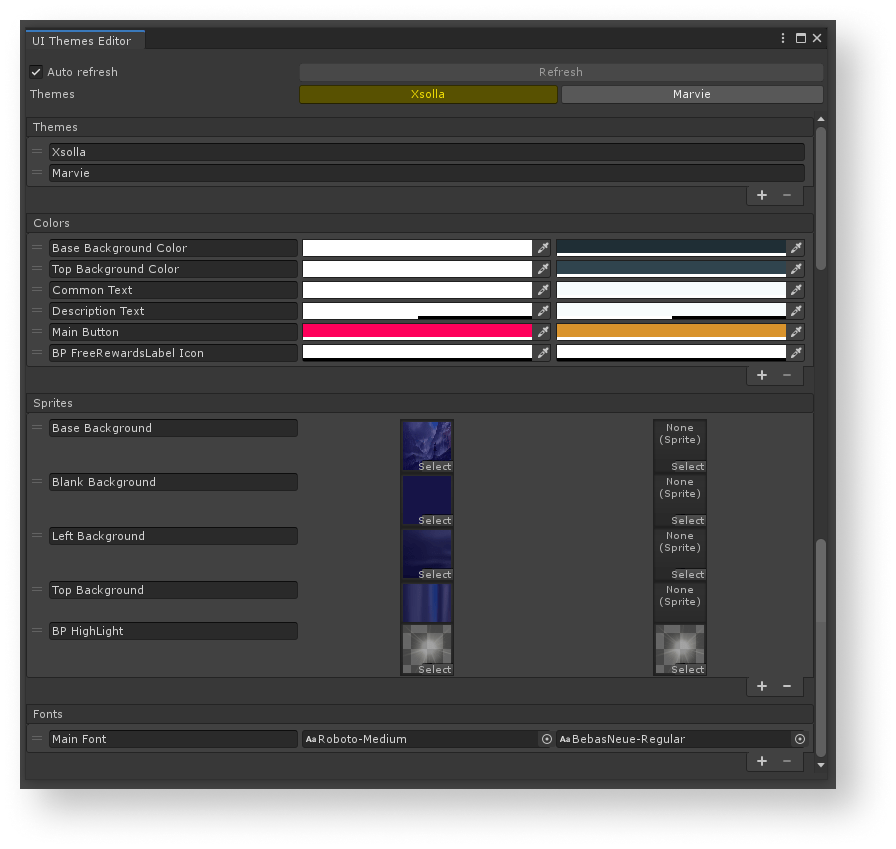
You can do the following actions to the lists:
- To add a new element, click the + icon in the lower part of the list.
- To delete the selected element, click the - icon in the lower part of the list.
- To change the order, click and hold the = icon and drag the element to the necessary position in the list.
- To rename the element, change the text in the field with the element name.
The property values are changed in the standard Unity ways:
- To change the color, click the property’s field and select a new value.
- You can change the font or sprite in one of the following ways:
- Drag an asset to the property field.
- Click the ⊙ icon and select an asset.
Biblioteca de temas
The theme library is inherited from the ScriptableObject class and is situated in the Resources/UIBuilder/ThemesLibrary directory.
Conecte o elemento da interface ao tema
To make the UI element visuals change according to the applied theme:
- Add decorators to the object and configure them.
- Add the property provider components to the object and configure them.
Decoradores
Decorators are components that apply theme properties (color, sprite, or font) to standard Unity UI elements and change them.
Decorators contain property IDs, not the values of properties, and a link to the UI element (image or text). Generally, decorators are like connectors between themes and UI elements. You configure decorators in the
List of decorators:
ImageColorDecorator— changes image colorImageSpriteDecorator— changes image spriteTextFontDecorator— changes text colorTextColorDecorator— changes text font
A decorator changes the element properties if the following events happen:
- Object is activated in the theme editor or during a game runtime.
- Current theme is changed in the editor or during the game runtime.
- Connection between an object property and theme is changed in the
Inspector panel. - Property value is changed in the theme editor.
- Object prefab is opened for editing in the theme editor.
To add a connection between the UI element and a theme, do the following:
- Add a decorator component to the object.
- Select the ID of the property from the theme.
After the decorator is added to the object, it tries to find a required UI element on this object and assign it to the Comp variable.
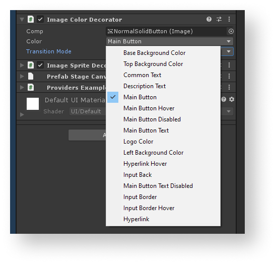
Example of decorator application:
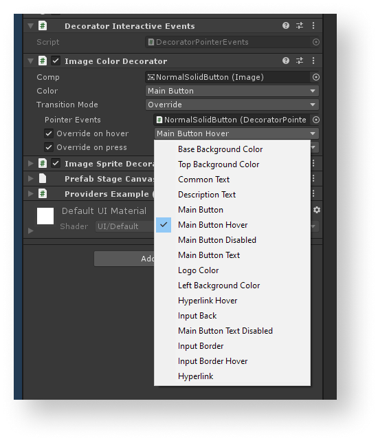
The ImageColorDecorator decorator is added to the image object. The Main Button ID for the color is specified in the example. As a result, the color specified in the theme for Main Button will be used for the image.
The decorator can dynamically change the component’s visuals while the game is being played and the user points at the object with a cursor or clicks the object.
To dynamically change visuals of the UI element:
- Add a decorator component to the object.
- Select the ID of the property from the theme.
- Add the
DecoratorPointerEventscomponent to the object. This component tracks the events of clicking the object and pointing a cursor at it. - In the decorator component, change the
TransitionModevariable value toOverride. - Assign the added
DecoratorPointerEventscomponent to thePointerEventsvariable of the decorator. - To change the visuals when pointing with a cursor:
- Check the
Override on hover box. - In the field near the box, select the ID of a property from the theme.
- Check the
- To change the visuals when clicking:
- Check the
Override on press box. - In the field near the box, select the ID of a property from the theme.
- Check the
Example of decorator’s application for dynamic change of visuals:
The ImageColorDecorator decorator is added to the image object. The Main Button ID for the color and the Main Button Hover ID for the color when pointing a cursor is specified in the example. As a result, the color specified in the theme for Main Button will be used for the image. When pointing a cursor, the color will change to the one specified in the theme for Main Button Hover.
Provedores de propriedades
Property providers are classes in the form of containers for theme properties. They are used for more convenient connections between the user code and themes.
List of property providers:
ColorProvider— contains a link to the color property.SpriteProvider— contains a link to the sprite property.FontProvider— contains a link to the font property.
All property providers have a PropertyDrawer for more convenient configuration via the
To configure a property provider and get the property value in a code:
- Add a property provider component to the object.
- Select an ID of a property from the theme.
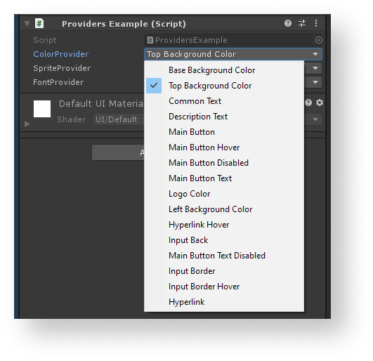
Example of property providers configuration:
- In the script, declare a variable and assign a property provider component to it.
- To get a color value, call the
GetValuemethod.
Example of the script:
- C#
 1public class ProviderExample : MonoBehaviour
 2{
 3
 4  [SerializeField] private ColorPrivider ColorPrivider;
 5
 6  private void Start()
 7  {
 8      Color color = ColorProvuder.GetValue();
 9  }
10
11}
Como trabalhar com widgets
Editor de widgets
To open a widget editor, go to the Unity editor main menu and open
The widget editor UI includes the following components:
Refresh button — lets you apply widget changes in prefabs.Auto Refresh box — lets you automatically apply widget changes in prefabs.Widgets section — contains the list of widgets.
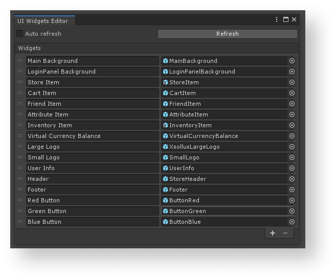
You can do the following actions to the list of widgets:
- To add a new widget, click the + icon in the lower part of the list.
- To delete the selected widget, click the - icon in the lower part of the list.
- To change the order, click and hold the = icon and drag the element to the necessary position in the list.
- To rename the widget, change the text in the field with the element name.
- You can change the font or sprite in one of the following ways:
- Drag a prefab to the field with a widget.
- Click the ⊙ icon and select a prefab.
Biblioteca de widgets
The widget library is inherited from the ScriptableObject class and is situated in the Resources/UIBuilder/WidgetsLibrary directory.
Conecte o elemento da interface do usuário ao widget
To easily replace UI elements with others, you should use widget containers instead of using widgets directly when building the UI. If you do so, you can simply configure the widget created by a container to change UI elements of the same type. The standard approach would require replacing all widgets manually.
The container creates a widget object as a child object and configures the RectTransform class properties for it, making the widget fill the whole space in the container.
When adding a container component to the UI element object, this object is used as a parent object for creating widgets.
The container changes the widget properties if the following events happen:
- Connection between an object property and widget is changed in the
Inspector panel. - Widget prefab is changed in the widget editor.
To connect the UI element and widget:
- Add the
WidgetContainercomponent to the object. - Select a widget ID.
If an object with a widget container is a prefab, you can change the container settings only in the prefab editing mode. This is because you can change the hierarchy of child objects inside a Unity prefab only in this mode.
When replacing the widget, the current widget is deleted and the new widget is created. Keep this in mind when designing the working logic of objects and their connections.
Example of using a widget container:
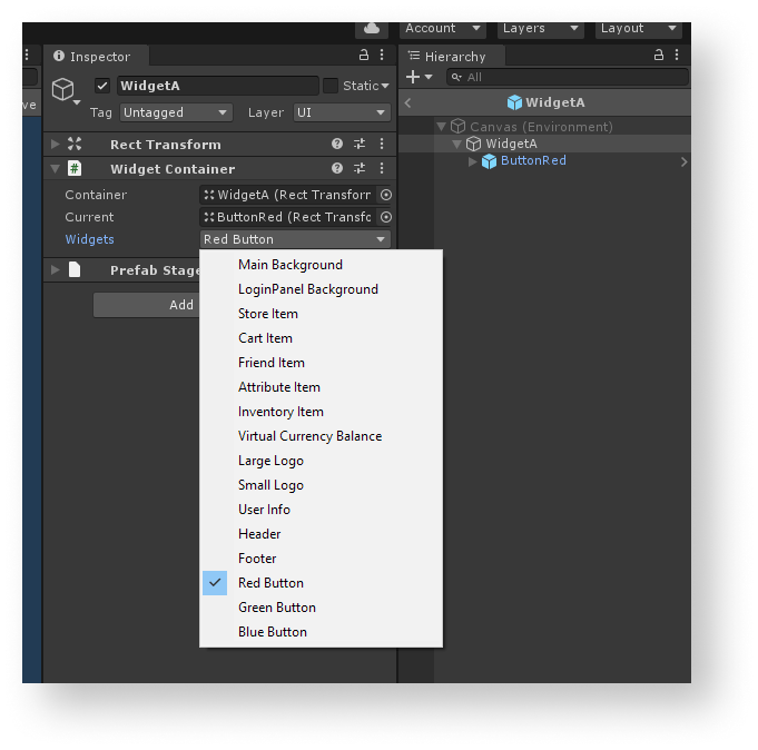
For the WidgetA object, the widget with the Red Button ID is specified in the example. As a result, the WidgetA object will be created using a prefab specified for the Red Button widget in the editor.
Estrutura do construtor da interface
While operating, the UI builder uses the following components:
UIProperty— objects with the following data:- ID of the property
- Property name
- Visual data (colors, sprites, fonts, etc.)
Theme— theme component. The theme lets you change the visuals of the UI and represents a collection of properties in different groups (colors, sprites, and fonts). Every theme has a name and unique identifier. You can access the theme property using the ID of the property.ThemesLibrary— library of all themes that exist in the project. It also contains the value of a current theme and provides methods for changing this value.ThemeDecorator— the MonoBehaviour class components that refer to the theme properties and apply the values of these properties to standard Unity UI components. TheImageColorDecoratordecorator, for example, changes the image color.UIPropertyProvider— classes that give access to themes’ properties. Use these components to easily connect the user code with the data from themes. TheColorProviderclass, for example, provides data about the colors.WidgetContainer— theMonoBehaviourclass component that lets you change the whole widget.WidgetsLibrary— collection of widgets that exist in a project. The component contains the list of all widgets and provides methods for getting the widget by its ID.
Encontrou um erro de texto ou digitação? Selecione o texto e pressione Ctrl+Enter.
