
How to use SDK to configure application UI
The SDK includes a UI builder. The UI builder lets you configure the visuals of the application UI.
You can change the UI by editing global settings that affect UI elements’ visuals — color, texture, and font. These properties group into a theme.
To swap the UI elements of the same type, you can use the widget wrappers — containers for created UI elements.
The UI builder contains 2 independent parts:
- Themes are responsible for working with visuals.
- Widget manager is responsible for working with widgets and lets you replace whole parts of the UI.
Work with themes
Theme is a XsollaUtilsTheme type asset. It contains the list of colors, fonts, and textures that are used by the UI elements. Every list is a set of key-value pairs where the key is a unique name of a theme parameter, and the value is a corresponding color, font, or texture.
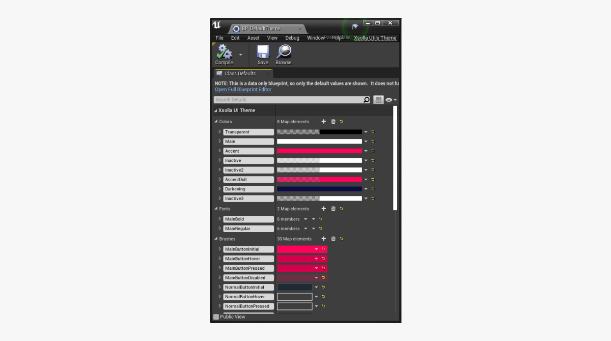
You can work with themes in
- To set the theme of the UI, select it in the
Interface Theme field. - To edit the selected theme, click the
🔎 icon near theInterface Theme field.
- To create a new theme, click the + icon near the
Interface Theme field. - To delete a selected theme, click the × icon near the
Interface Theme field.
Connect UI element to theme
To connect the UI element to the theme:
- In the UI element widget blueprint, get access to the theme by the following methods:
GetCurrentTheme— returns the current theme specified in the plug-in settings.GetTheme— returns a theme by the name specified in theThemeClassparameter.
- Use the following methods to get the values of definite parameters from the theme by passing the theme parameter name to them:
GetColor— gets color value.GetFont— gets font.GetBrush— gets texture.
In the demo project, every widget that supports themes has a set of String type parameters with theme parameter names. These parameters are used for setting up a visual for the UI element.
To find examples of widgets that support themes, go to
Work with widget manager
The widget manager is a mechanism that lets you automatically replace the UI elements with the UI elements of the same type by changing their visuals and behavior.
To create the UI that supports the widget manager, the following conditions should be met:
- Create a widget with the specified unified interface for the UI element.
- Define the type name for the UI element widget in the widget library.
- Pass the widget type for the UI element to the wrapper. The wrapper is a container for creating the UI elements. The name of the widget type should be identical to the name in the library.
- When creating a UI, use the wrapper instead of the widget.
Widget wrappers
A wrapper is a container that creates a required widget in the area of the page that is occupied by the wrapper.
Using the widget wrappers when creating the UI lets you automatically change the UI elements within the whole UI. To do this, change the widget in the wrapper. The standard flow, that uses UI primitives, suggests replacing all widgets manually in this scenario.
Here are the following wrappers for different widget types:
W_ButtonWrapper— for a buttonW_InputWrapper— for an input fieldW_TextWrapper— for textW_RichTextWrapper— for rich textW_ImageWrapper— for an imageW_CheckBoxWrapper— for a box
In the
You can find the widget wrappers blueprints in
The wrappers use the widget manager methods to interact with the widgets.
Widget interfaces
To make the UI primitives interact with the widget wrapper as they would with the usual widget, the wrappers use unified interfaces.
There are the following wrappers for different widget types:
BPI_PrimitivesButton— for a buttonBPI_PrimitivesInput— for an input fieldBPI_PrimitivesText— for textBPI_PrimitivesRichText— for rich textBPI_PrimitivesImage— for an imageBPI_PrimitivesCheckbox— for a box
You can configure interfaces for the UI elements widgets in the
You can find the widget interfaces in
Widget library
The widget library is an asset of the XsollaUtilsWidgetsLibrary type that contains the list of widget classes in a form of key-value pairs. The key contains the name of the widget type and the value contains the widget class that will be created by a corresponding wrapper with this key.
The widget library works as a connector between the wrappers and widget classes.
The BP_DefaultWidgetLibrary default widget library is included in the SDK. This library contains the list of UI elements from the demo project.
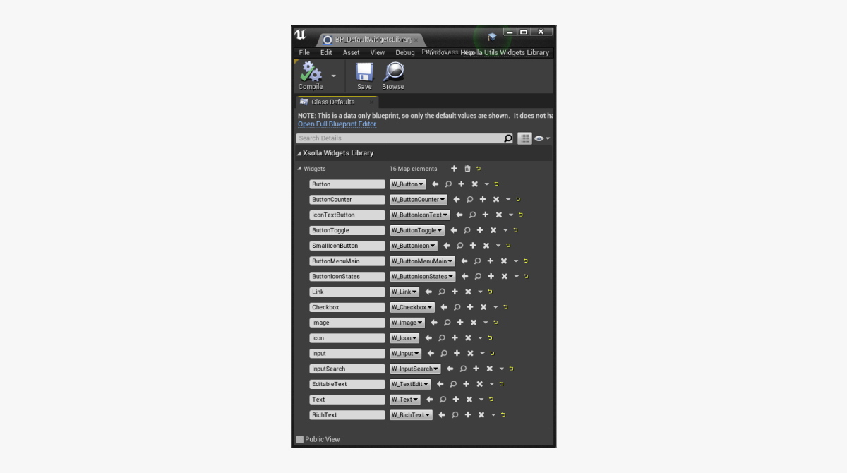
You can work with the widget library in
- To install the current widget library, select it in the
Widgets Library field. - To edit the selected widget library, click the
🔎 icon near theWidgets Library field.
- To create a new widget library, click the + icon near the
Widgets Library field. - To delete the selected widget library, click the × icon near the
Widgets Library field.
Use the following methods in the wrapper blueprints to get access to the widget library:
GetCurrentWidgetsLibrary— returns the current widget library specified in the plug-in settings.GetWidgetsLibrary— returns the specified widget library by the name specified in theWidgetLibraryClassparameter.
Use the GetWidget method in the wrapper blueprints, to get the widget type from the library.
Methods of widget manager
The following methods are used by the wrappers to interact with the widgets. Use them when creating your own wrappers and widgets that support themes.
Methods for working with buttons
| Method name | Description |
|---|---|
SetButtonEnabled | Sets the button state that defines whether the button reacts to the keyboard, mouse, timer events, etc. |
IsButtonEnabled | Returns the button state that defines whether the button reacts to the keyboard, mouse, timer events, etc. |
GetWidget | Returns the list of UI primitives that contain the widget. Is used for subscribing to the button-clicking event. |
ConstructButton | Initializes the button widget. Is used by the widget wrapper. |
SetExtraData | Sets a list of additional data for a button. Every widget processes the received data, demonstrates it, or uses it according to the inner logic. For example, you can use the set of additional data to pass the list of the drop-down menu elements to the button that has a drop-down menu. |
SetIconData | Sets a list of icons to display for a button. Use this method to specify the icon size and the distance between the icon and other button elements. |
SetButtonSelected | Sets the toggle position. For example: on or off, in cart or not in cart, etc. |
GetThemeData | Returns the set of theme parameters used by the button widget. |
SetButtonText | Sets the text for a button. |
Methods for working with boxes
| Method name | Description |
|---|---|
SetIsChecked | Sets the state of the box whether it’s checked or unchecked. |
GetIsChecked | Returns the state of the box. |
IsTickHovered | Checks whether the cursor hovers the box area. |
ConstructCheckbox | Initializes the box widget. Is used by the widget wrapper. |
GetWidget | Returns the list of UI primitives contained by the widget. Used for subscribing to the box events. |
GetThemeData | Returns the set of theme parameters used by the box widget. |
SetText | Sets the text for the box. |
GetText | Receives the text for the box. |
Methods for working with text or rich text
| Method name | Description |
|---|---|
GetText | Returns the text value. |
SetText | Sets the text value. |
GetWidget | Returns the list of UI primitives contained by the widget. Used for subscribing to the text events. |
GetThemeData | Returns the set of theme parameters used by the text widget. |
ConstructText | Initializes the text widget. Is used by the widget wrapper. |
Methods for working with images
| Method name | Description |
|---|---|
GetImage | Returns the image. |
SetImage | Sets the image. |
GetWidget | Returns the list of UI primitives contained by the widget. Used for subscribing to the image events. |
GetThemeData | Returns the set of theme parameters used by the image widget. |
ConstructImage | Initializes the image widget. Is used by the widget wrapper. |
Method for working with input fields
| Method name | Description |
|---|---|
GetText | Returns the text to the input field. |
SetText | Sets the text to the input field. |
GetWidget | Returns the list of UI primitives contained by the widget. Used for subscribing to the input field events. |
ConstructInput | Initializes the input field widget. Is used by the widget wrapper. |
GetHint | Returns the tip text for the input field. |
SetHint | Sets the tip text for the input field. |
SetupFocus | Sets the focus on the input field. |
GetThemeData | Returns the set of theme parameters used by the input field widget. |
Found a typo or other text error? Select the text and press Ctrl+Enter.
