
Create site and customize main blocks
To create a Web Shop:
- Create a project in the Publisher Account.
- Create a website.
- Configure the key blocks.
- Set up shopping cart.
- Test the site.
- Publish the site.
Create site
- Open your project in Publisher Account and go to Storefronts > Websites section.
- Click Create site.
- Select the Web Shop template.
- Add a URL to an external platform where your game is available. This allows you to quickly create a page in the style of your game: images and the game title, developer information, and a color scheme are automatically added to the page. If you don’t want to use the game data, set the Copy game info via App Store or Google Play URL toggle to inactive.
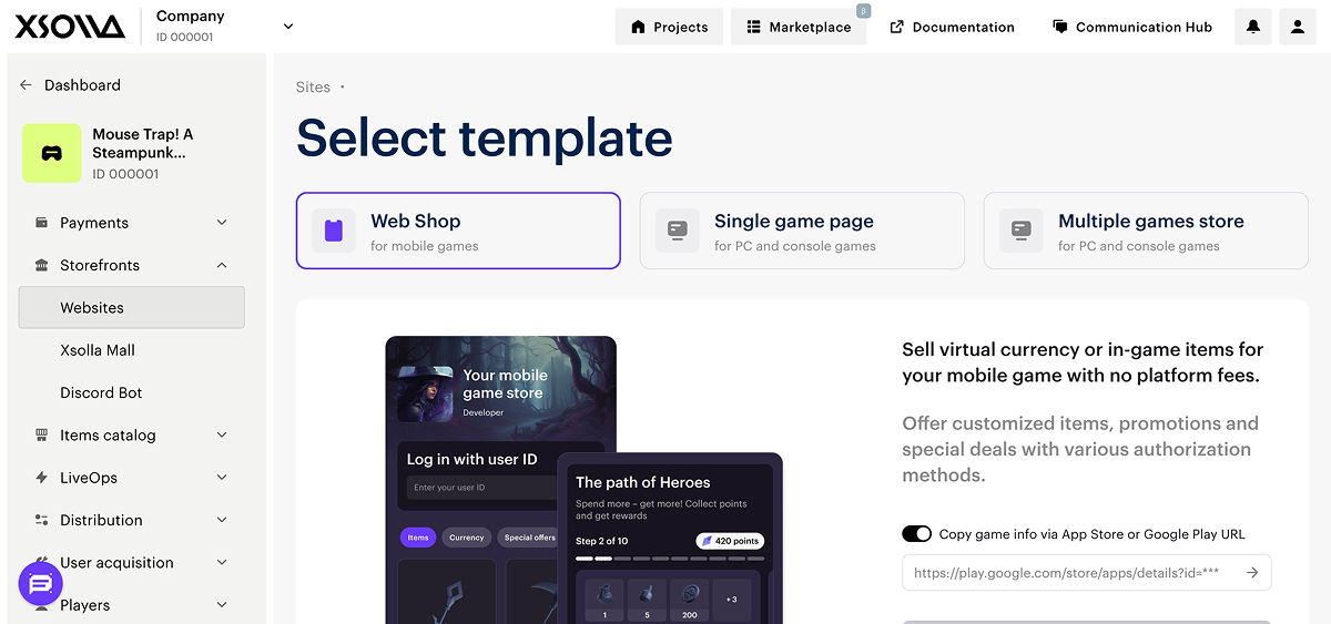
- Click Create Web Shop.
- Customize the site theme:
- colors of key elements
- border radius of elements
- fonts for headings and body text
- Edit the content:
- upload images and videos to blocks
- change the texts visible to users
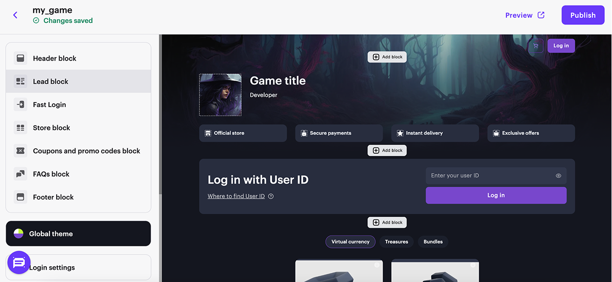
You can also create and configure additional pages for the website, for example, to publish news, set up a store with different items bundles, or run a blog.
Configure key blocks
All blocks contain default settings. You can choose to enable or disable specific block functions and customize them as desired.
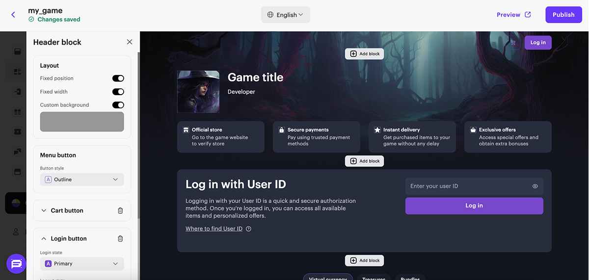
Set up Header block
The block in the header of the site. Header displays user information and contains site navigation elements. You can fix the block so it remains visible on the screen when scrolling through the site.
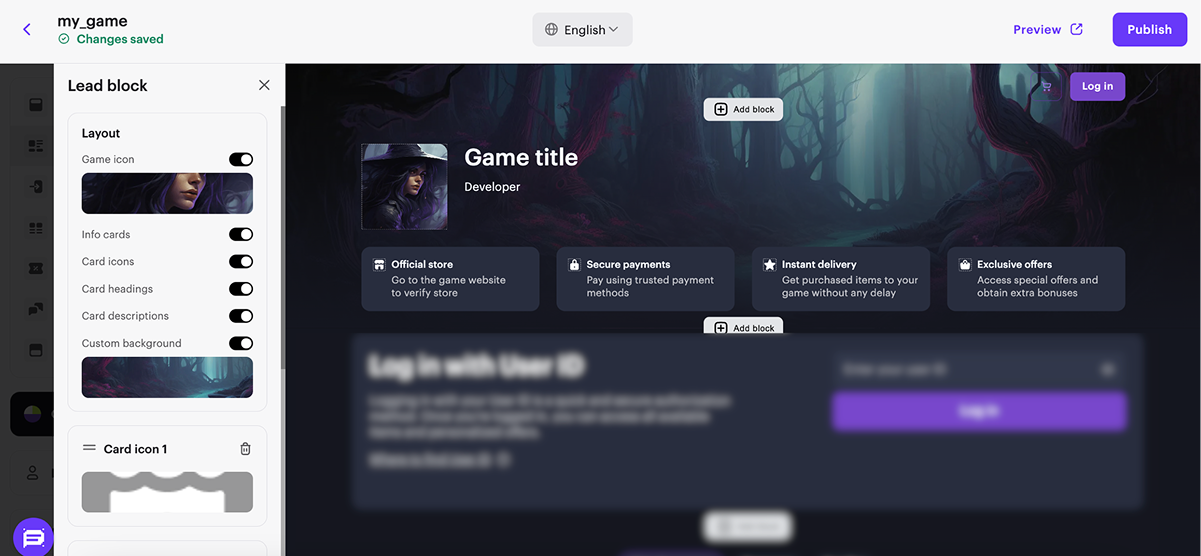
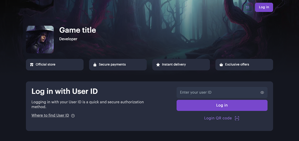
Set up Lead block
Block with basic information about your Web Shop - the game the site is created for and who the developer is. If you didn’t add a link to Google Play or the App Store when creating the site, configure the following elements of Lead block in the main part of the constructor:
- Add the game icon.
- Specify the game name.
- Specify the game developer.
- Adding a background image.
- To display site information on the Info cards, set the following toggles to active:
- Card icons
- Card headings
- Card descriptions
Set up Fast Login block
The Fast Login block allows you to highlight the authorization step and streamline the user’s path to purchase.
To use this Fast Login block, you must first select an authorization method in the Login Settings section. The appearance and behavior of the block depend on the chosen authentication method.
The Fast Login block is automatically added to sites created using the Web Shop template.
If your site doesn’t include this block, you can manually add it in the site builder.
To add a Fast Login block:
- Open the project in Publisher Account and go to the Storefronts > Websites section.
- In the Sites section, select your site and click Open Site Builder.
- Click Add block.
- Choose Fast Login block.

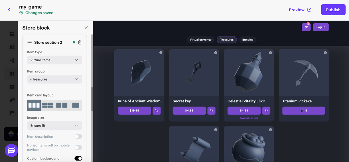
Set up block Store
Block for selling virtual items, bundles, and virtual currency packs. This block contains automatically created sections you can delete and replace with new ones.
- If needed, customize the block by:
- Adding a title
- Enabling the display of item group names
- Enabling tabs for easy navigation in the store
- Adding a custom background
- Configuring the login call-to-action button.
- In the store section, select the type of item you want to sell on the site and its group from the drop-down list.
- In the store section choose Item card layout:
- Featured. This card layout allows you to draw the attention of users to items or special offers. We recommend that you use this layout for bonus and discount promotions, and time and number limited promotions and items and bundles.
- In the card layout settings you can:
- hide or show an item’s image and description
- ensure fit or maximize an item’s image
- change text color
- use a custom background for the carousel
- In the card layout settings you can:

- Horizontal. This card layout allows you to place the name, description, and price of the item to the right of the image.
- In the card layout settings you can:
- hide or show an item’s description
- ensure fit or maximize an item’s image
- enable or disable horizontal scroll on mobile devices
- use a custom background for the section
- In the card layout settings you can:

- Vertical. This card layout allows you to place the name, description, and price of the item at the bottom of the image.
- In the card layout settings you can:
- hide or show an item’s description
- ensure fit or maximize an item’s image
- enable or disable horizontal scroll on mobile devices
- use a custom background for the section
- In the card layout settings you can:
- Large. We recommend using this card layout for bundles and bonuses. This shows the composition of the card on the landing without clicking on the card.
- In the card layout settings you can:
- hide or show an item’s description
- ensure fit or maximize an item’s image
- enable or disable horizontal scroll on mobile devices
- use a custom background for the section
- In the card layout settings you can:
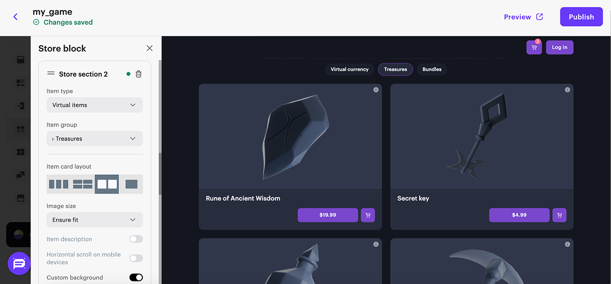
- If needed, customize the card layout by enabling the corresponding toggles in the card layout settings.
- To hide the section when it has no content, set the Hide section if empty toggle to active.
Set up Footer block
- Select layout style.
- Customize background.
- Add Share options buttons, configure social media icons.
- Add links to the social networks.
- Add age restrictions.

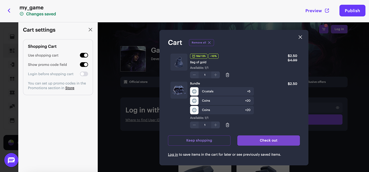
Set up shopping cart
You can use the shopping cart on the website. To do this:
- In the main section of the builder, go to the Cart settings block.
- Set the Use shopping cart toggle to active.
- Configure additional shopping cart functions (optional). To do this, set the corresponding toggles:
- Show promo code field – allows users to use a promo code or coupon in the shopping cart interface;
- Login before shopping cart – opens the authentication window when navigating to the shopping cart if the user was not previously logged in.
Continue reading
Found a typo or other text error? Select the text and press Ctrl+Enter.
