Integrate SDK on application side
General purchase logic
- Implement the logic of getting payment tokens in one of the following ways:
- Using the Store library (recommended):
- To purchase a single item, call the
createOrderByItemSkumethod. - To purchase the items in the cart:
- After the user has filled the cart, call the
fillCurrentCartWithItemsmethod. - Call the
createOrderFromCartByIdorcreateOrderFromCurrentCartmethod.
- After the user has filled the cart, call the
- To purchase a single item, call the
- Using the Store library (recommended):
- Using the Catalog API.
- Using your own server methods or BaaS solution methods.
- Implement the logic of payment UI opening:
- kotlin
1val intent = XPayments.createIntentBuilder(this)
2               .accessToken(<accessToken>)
3               .isSandbox(<isSandbox>)
4           	.setStatusReceivedCallback(object : StatusReceivedCallback {
5               	override fun onSuccess(data: InvoicesDataResponse) {
6                   		Log.d(TAG, "StatusReceivedCallback is fired. Result data = $data")
7               	}
8           	})
9           	.build()
Payment UI opening options
Xsolla SDK for Android provides 3 ways to display the payment interface within the application:
| WebView | Custom Tabs | Trusted Web Activity | |
|---|---|---|---|
| Pros |
|
|
|
| Cons |
|
|
|
WebView display example:
Custom Tabs display example:
Trusted Web Activity display example:
Set up method for opening payment UI
By default the SDK uses Custom Tabs. If Custom Tabs is not available on the user’s device, e.g., if a suitable browser is not installed, the SDK will automatically switch to other methods to open payment UI: first WebView and then on the external browser installed on the device by default.
You can set a different primary method of opening the payment UI using the setActivityType method.
Example:
- kotlin
1XPayments.createIntentBuilder(this)
2  .accessToken(AccessToken(token))
3  .isSandbox(BuildConfig.IS_SANDBOX)
4  .setActivityType(ActivityType.TRUSTED_WEB_ACTIVITY)
5  .build()
In case the primary method is not available, the SDK switches to other methods in the following order: Trusted Web Activity > Custom Tabs > WebView > external browser installed on the device by default.
If you want to install Trusted Web Activity as the main method of opening the payment interface, contact your Customer Success Manager or email to csm@xsolla.com.
You will need to provide the following information:
- the SHA256 fingerprints of your application’s signing certificate
- application ID
For more information about Trusted Web Activity, see Google documentation.
Set up payment UI close button
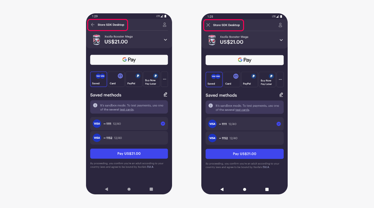
We recommend to set up a close button for the payment UI, since the browser bar and standard navigation elements are not visible to the user in WebView and Trusted Web Activity. To do this, in the PaymentOptions object in the ui.mobile parameter, pass the mobile = UiMobileProjectSettingHeader object with the closeButton=true parameter.
You can select the icon that will be displayed on the button. To do this, pass one of the following values in the closeButtonIcon parameter:
“arrow”— to display the ← icon“cross”— to display the × icon (used by default)
Example of PaymentOptions object:
- kotlin
 1val paymentOptions = PaymentOptions(
 2            isSandbox = isSandbox,
 3            settings = PaymentProjectSettings(
 4                ui = UiProjectSetting(mobile = MobileSettings(header = UiMobileProjectSettingHeader(closeButton = true, closeButtonIcon = "arrow"))),
 5                returnUrl = "app://xpayment.${getApplication<Application>().packageName}",
 6                redirectPolicy = SettingsRedirectPolicy(
 7                    redirectConditions = "any",
 8                    delay = 5,
 9                    statusForManualRedirection = "any",
10                    redirectButtonCaption = "Back to the Game"
11                )
12            )
13        )
Example of using the closeButton and closeButtonIcon parameters in WebView and Trusted Web Activity:

Found a typo or other text error? Select the text and press Ctrl+Enter.
